Update v0.15.0 - Simplified color picker, thresholds, variants for variables++
Hi all
I’ve probably tried to do too much at the same time, instead of just releasing smaller changes at a time. But here it is, a month’s worth of changes. It might not look like much, but that’s also because I removed a big piece of what I’ve spent time on. I realized that it wasn’t the correct way to go ahead with major new features, so it’s removed for now.
Simplified color picker
I’ve added a simplified color picker based on the default handpicked colors of the Tailwind CSS framework. This is meant as a simple option in order to select colors that work well together. If you feel that 100% custom colors is necessary, give me a shout!
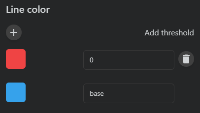
Thresholds
This is the beginning of value based styling. To start with, only colors can be applied, but it does make for some nice changes. Insights is the first to get this feature, but it will spread to other components.
It work by adding thresholds on top of the base layer. When the value exceeds the threshold, this color is used.
You can add as many thresholds as you like.
Variants
In order to supply users with consistent components, I’ve now started to create some re-usable controls for boolean and numeric values. As an easy start, this is now used for logic variables.
Boolean
Four variants exists for boolean values.
Icons can be selected for true and false values, in addition to colors for the icons.
Numeric
Two variants exists for numeric values.

The first one is the slider, which is currently displayed as text in card mode, and as a slider in view mode. The second one is composed of the value with unit and two buttons to increase of decrease the value.
I will try to reuse these components for capabilities as well, but I’m also questioning if I should refactor the current capability widget to resemble the native Homey look. And create a new capability widget with all the options and customizations 
I’ve also worked on or completed the following:

