Yes, I‘m using an iPAD in Kiosk mode. Same challenge I have to refresh manually. It‘s not too bad. More a problem when you (or others more likely) quickly look at the Dashboard and forget they look at stale data.
A little UI glitch I observed: it seems that font size for longer texts gets reduced (so far ok I guess), but this also influences the icon size. Leads to strange mis-alignments that hurt the eye
Hi
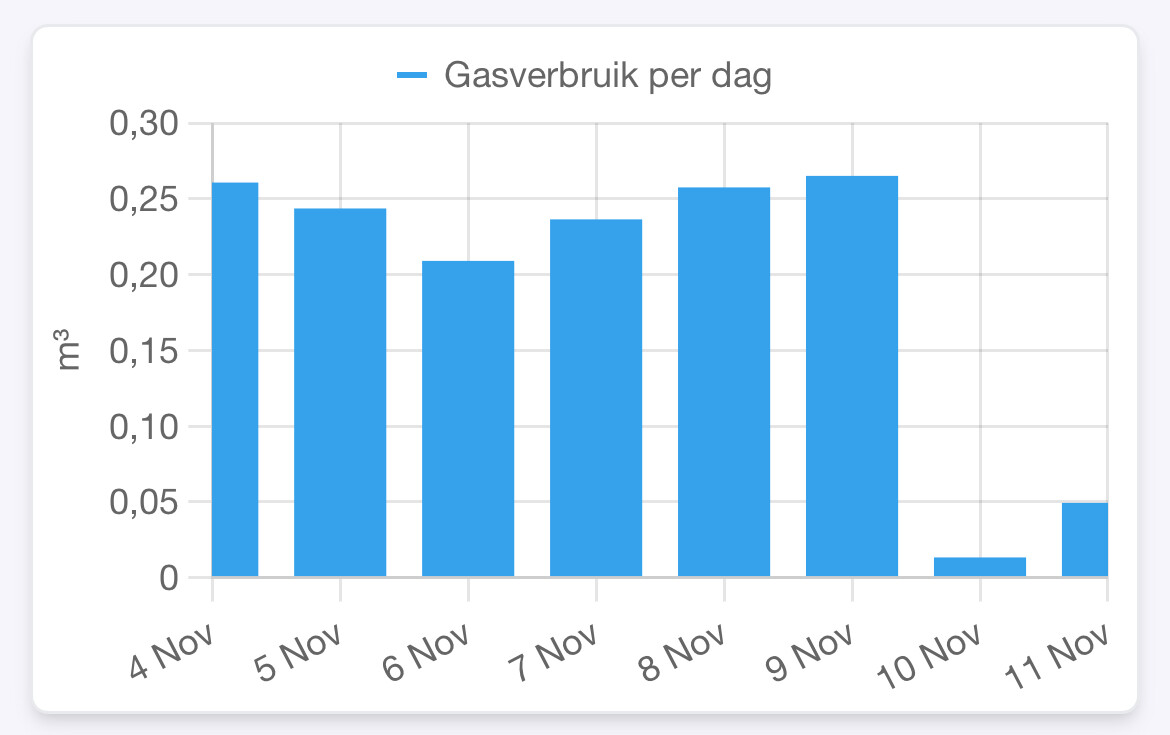
Based on the graph from insight, you do some kind of aggregation in order to reduce one week of data into one value pr day. I’m just guessing that you’re using average aggregation when it should be max or last value within each time period, as your meter resets each day
How does it look if you use max instead of last? I know that Homey Insights has issues with timestamps. Especially around winter saving time adjustments, and I know that Athom has a fix for their issues in testing. Might be that they released that and it somehow affects it🤔
Can you, or anyone here, tell me what some aggregation types mean / what they do?
Especially Min, Sum, First and Last
(yes I tried Ggl, but it ended up in scientific blur)
Thanks!
Example:
You request last 1 week of data.
Response is a week worth of measurements every 1 hour.
You configure sample rate to be 1 day.
Measurements are grouped into days
For each group, reduce from 24 values to 1 value by applying an aggregate function.
For max this means that the greatest value among the 24 values are selected.
For min this means that the smallest value among the 24 values are selected.
For first this means that the oldest (based on timestamp) is selected.
For last this means that the newest (based on timestamp) is selected.
For sum this means that the sum of the 24 values are returned.