Hi all,
I wanted to suggest a few UI improvements based on my previous experience with Apple Home.
-
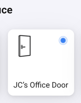
If I have a contact sensor, I can’t set it to type Door, or Window, I can add an icon but it’s a status icon, and doesn’t reflect the state of the door or window, instead I have to rely on a blue dot that shows when the window or door is open.
-
I love that you can see the historical values of all your devices, but again, contact sensors are highlighted as “Alarmed turned on/off”, Apple Home does it so much better saying door open/closed. Similar to what we can do with smartplugs, maybe we can add a “category” or “type” dropdown for contact sensors.
-
Thermostats are confusing, in the image with my lamp, a smart plug and the thermostat, what’s on and what’s off? Lamp: Off, Plug: On, Thermostat looks on, but it’s off. when heating, the small number that displays the temperature goes orange.
-
Apple home does this very well, when your device starts with the room name, it doesn’t display it when showing it in the context of the room, in Homey, now I see all my devices in the list, with the full name, and feels bloated.
Thanks!


