Looks very nice.
Please view your HTML layout, i.e. how you built up the widget.
I have included details on how I set up the widget. Please note that I am not an HTML expert whatsoever, so feel free to comment if I can improve the code ![]() . I used W3 Schools’ HTML tutorial as a resource.
. I used W3 Schools’ HTML tutorial as a resource.
Basic structure
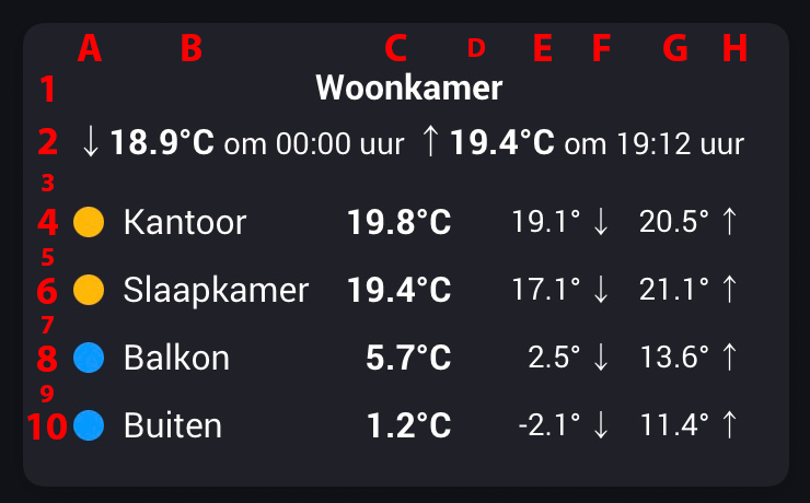
The information included in the widget is formatted in one table consisting of ten rows (1-10) and eight columns (A-H). The information displayed consist of plain text, Homey tags & variables that provide the sensor values and date stamps, and CSS style coding that creates the colored bullets (those are not characters).
I split the creation and formatting of the table in several smaller parts, to keep things maintainable:
- Definition of the colored bullets;
- Info of the main room (rows 1 and 2);
- Info of the additional rooms (rows 4, 6, 8 and 10);
- General formatting (incl. spacer rows 3, 5, 7 and 9).
Bullets
Each colored bullet is pre-defined in a CSS style tag. Each bullet is defined in the same manner. Only the hex value of the color is different. I used Homey’s THEN logic card ‘Create [text] as text tag’ to define each individual bullet and then combine the resulting tags in one single variable ‘EDW HTML Style Tags’. The screenshot shows the code for one bullet (a green one) and setting the said variable.

Info on the main room (rows 1 and 2)
The first two rows include information on my main room: the living room (‘Woonkamer’). Both rows merge the eight columns into one, resulting in one cell per row. The screenshot shows the HTML code. Certain data elements are formatted in bold or have a smaller font size.

Info of the additional rooms (rows 4, 6, 8 and 10)
For each of the four additional rooms I created a separate row containing the depicted information. The set up is the basically the same for each room, with one key difference: the first of these rows also defines the column widths. The other three follow this width. I’ll focus on the first two as an example: Office (‘Kantoor’) and Bedroom (‘Slaapkamer’). I used Homey’s THEN logic card ‘Create [text] as text tag’ to define each individual row. So one of such a flow cards per row, to keep the HTML code manageable.
Row 4: Office (‘Kantoor’) - The first column (A) contains the colored bullet. I use three possible color options, depending on the temperature: blue for temperatures below 19 °C, red for temperatures above 21 °C and orange for in between temperatures. I defined these thresholds in a variable (DV TEMP Grens Koud and DV Temp Grens Warm) for easier maintainability. The flow basically checks, based on the current temperature, which threshold applies and then sets the ‘EDW Temp Bolkleur’ variable to the name of the colored circle as defined in the CSS style code.
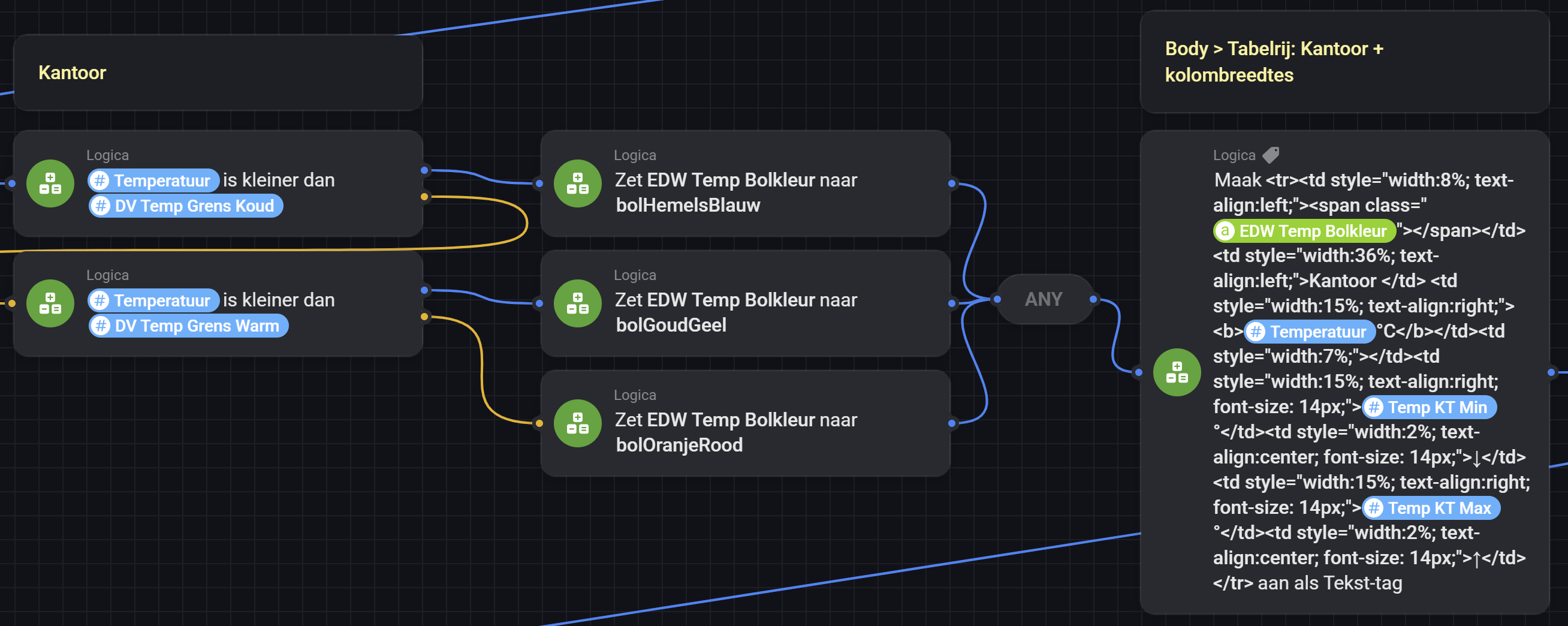
Next, as part of the HTML code, I can now simply refer to that variable: <span class="EDW Temp Bolkleur"></span>. The remaining columns contain text labels or the actual values based on Homey tags/variables. Note that column D is a spacer, without any values (just for formatting). The current temperature is formatted in bold; the min/max temperatures in a smaller font size.
Row 6: Bedroom (‘Slaapkamer’) - Is basically the same as the Office row, except for the column widths as indicated before. This also applies to the rows of the other rooms/locations.

General formatting (incl. spacer rows 3, 5. 7 and 9)
The last step is to combine the results/HTML code of the prior steps into one HTML page that is input for the status widget. I included this in the status widget flow card. It first defines the start of the HTML page. Then the section, including the CSS definition of the colored bullets. As I defined the CSS code for generating these bullets before and included them in the ‘EDW HTML Style Tags’ variable, I can now simply refer to that variable. Next the body section, that defines the table, includes each of the previously defined rows and adds a spacer row between each of them. Finally the card defines the background and text colors of the status widget.

Things I ran into / am not sure of
- I was not sure whether the widget automatically updates itself, so I included a change in any of the current/min/max temperatures as a trigger for setting the status widget. In my case these are 14 trigger. Perhaps the sensor values update themselves. However I noted that the colored circle is not always updated. Specifically when you open the dashboard (after it was closed), the colored bullet is not always updated/in line with the temperature value. As such I included an additional trigger that updates the status widget every minute. @Adrian_Rockall: Am I correct that Enhanced Device Widget’s status widget does not update in the background when the dashboard is closed?
- My assumption was that defining the table width as 100% it would completely fill the status widget area. However this is not always the case. Sometimes when omitting a table width tag or setting it to exactly 100%, the table does not use the full widget area (compacts to the left). The work-around is to set a width high than 100%. You’ll need to experiment a little bit on which width is the correct one in your case. The status widget for the temperatures does format correctly, in my case, when setting the width to 100%. However the status widget for humidity requires me to set the width to 114% to properly fill the available space. @Adrian_Rockall: I believe this behavior was also reported by @Peter_Kawa. Not sure whether this is something you are planning to look into.
- Make sure to remove any ‘returns’/new lines in your HTML code, as each results in an extra blank line at the top of the status widget. I understand this is the result of the way the status widget validates the input text. So basically I removed all returns, tabs, spaces between tags in the HTML code and maintain the code manually directly in the advanced flow (instead of in an HTML editor).
- I also included the and tags, which are normally needed when you start a blank HTML page. Not sure whether they are needed in case of the status widget. Nevertheless, it does not seem to matter, as it works.
Thank you for the detailed explanation.
I will definitely make this too.
![]()
The status widget will only update when the Flow action card is run. It has no knowledge of changes to the tags you have included. So it is up to the Flows to trigger on changes and refresh the status widget.
I’m not sure about the width as the content is just set into a div tag as html. The div tag has some boundaries plus Homey also has boundaries it applies to the content.
Could you describe how you created your own image with status Information step by step?
Hi. Just wanted to share my Homey Dashboard.
The dashboard is presented on an old iPad Pro, which I built into a vintage iMac G4 from 2002.

The iMac has the following features:
- An adjustable arm which makes it easy to access the dashboard from both sides of our kitchen island.
- The original monitor has been replaced by an old iPad Pro 12.9”. To fit the iPad I’ve 3D-printed a black frame which makes it easy to remove the iPad if needed.
- Built-in Homepod mini speaker in the base, which is set up for Siri-activated shortcuts to run various Homey flows.
- A motion sensor mounted in the ceiling above the iMac automatically wakes up the iPad when someone is near.
The Homey Dashboard has the following features:
- Weather forecast and rain radar for the next 90 minutes, which is essential when you live in Bergen, Norway - one of the rainiest cities in Europe

- Information about
- Next postal delivery
- Next bus departure from our house
- Battery status for our two electric cars
- Energy prices and consumption, including car charging consumption
- Indoor and outdoor temperatures
- The most important flows for control of
- Lights
- Sun shading/screens
- TV
- Sonos-playlists
- Robot vacuum
- Pre-heating of cars
- Sonos control of various zones
- Control of the Rituals Perfume diffuser
I hope this can be of inspiration to someone.


How did you get the buss schedule in? I live in Trondheim, Norway and would love to do the same!


This looks amazing! Nice inspiration!
Hi Kristian. You just install the app “Norske tjenester”. Then add a new device called “Entur” and follow the instructions. On my dashboard I’ve used the dashboard widget “Datavista” to show a variable from “Entur” called “Avgang”.
Great. I am tinkering with it as we speak ![]()
![]()
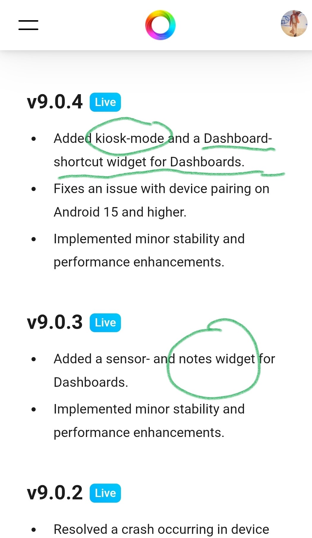
Maybe a stupid question: how did you create the link to other dashboards?
I cannot find that option anywhere.
I don’t have that option in my list; I also don’t see “notes”
Ok, already found it; needed to install TestFlight. ![]()
I also ran into that problem, I assumed that the apps in the Play Store were updated automatically.
But looked last night and had to manually update Homey in the playstore.
I still have to see where I can set the apps to be updated automatically.
The strange thing is that automatic updating is enabled in the Play Store settings.
And how did you add the wifi QRcode?
Already found it: the “Galerij” app.
How do you configure kiosk mode, I am not able to find anything regarding that in the app.
Looks awesome! How did you get the temperature at the cabin to appear here?
