Hi @Elmar
I have a huge flow with all my relatives and friends. The day after a person had his birthday I set the next upcoming birthday.
Hi @Elmar
I have a huge flow with all my relatives and friends. The day after a person had his birthday I set the next upcoming birthday.
It would be way better if the App Birthdays would create a widget or make it possible to get it from a variable with the upcoming birthday ![]()
I switched from Sharptools to Hdashboards and now Homey Dashboards. I only use my Samsung galaxy s23 ultra because allmost everything is automated and in extraordinary cases Homey sends me a notification. And then I open a dashboard…
The home screen is nice to use, the first screen when you open the mobile app.
With the datavista app I can present all relevant information in just a few labels and status badges. Many thanks to the developer!!
But, sometimes one wanna open a dashboard and that is not so user friendly. Click on more, click on dashboards (blegh, I finally found it…) and the choose your dashboard. In cases one wants to open a special dashboard more times a day it just cost too many clicks to enjoy the dashboard.
Athom, why is it not possible to make a dashboard favourite (just like devices, moods and flows) and put it on your home screen. Just one click away… (or develop a dedicated dashboard app.)
Or a challenge for an app developer?
Part of my homescreen
Nope not yet
Send them a mail back
Nice. Also the use of F1TV.
What device are you using? Because the screens are so tall with lot of space.
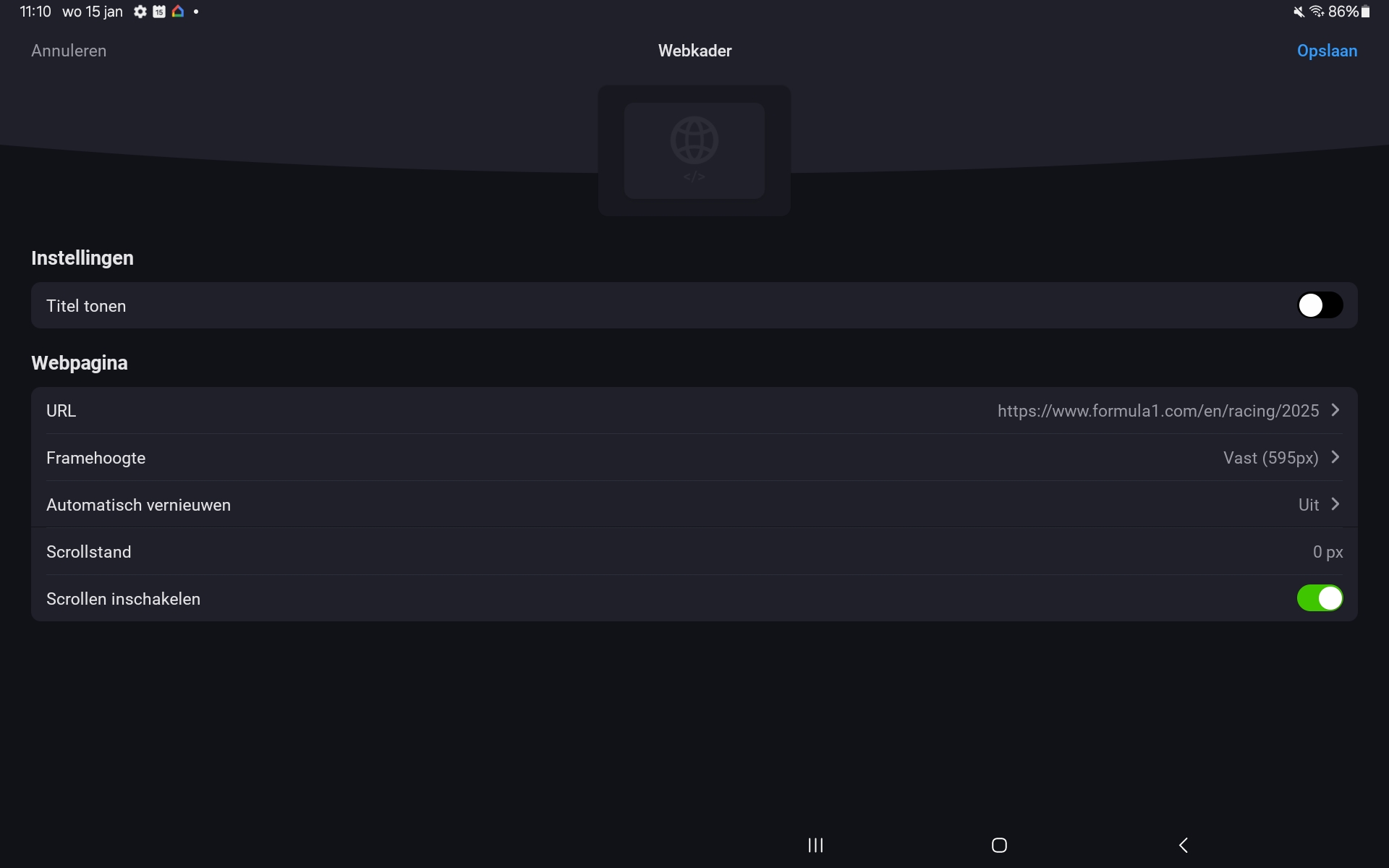
For the schedule in the middle it is a web frame widget which you can make as large as you like.
And the live timing:
You can also activate the scroll function
Rogier
Thank you!
What type of tablet are you using?
Samsung galaxy tab 9+
If you install the buienradar app from the homey app store, you will get a dedicated buienradar widget. Is that not solving most of everyones problem?
Hi @KvM
That widget is useless. It refreshes the clouds ones a minute. This means you have to keep your eyes open for at least a minute in order to see which direction the clouds are going.
And it does not give you a 3 hour forecast.
To me this widget is useless. I send a while ago an email to Athom. No priority I guess.
Rogier
I see. That makes the situation very different indeed. Thanks for explaining
how did you put the min and max value in the progress bars, I can’t do it, thanks in advance
Hi Mark,
What is your opinion? I can’t believe why this is taking such a long time to solve this issue with the buienradar (weather forecast) widget.
Did they respond yet?
Rogier
Maybe I misunderstood things, but where did you get the “power” data for the dishwasher from. I cannot select any power value for a progress bar widget…?
An update with some improvements on my dashboard design. ![]()
I created a basic image of my house, and visualized the energy status in a widget.
I’ve used the Enhanced Device Widget Status Display with an advanced flow to change the status based on my live energy conditions.
Also created a simple background for the other data widgets with some gradient coloring to look a bit more modern. The data is fixed in tables so they have an absolute position within the widget.
Next step is that I want to include the live data in the energy status visual, which is actually quit easy to do. Biggest challenge here is table alignment, and probably a redesign of the images that I currently use. Really happy with the possibilities of the Homey Dash App right now.

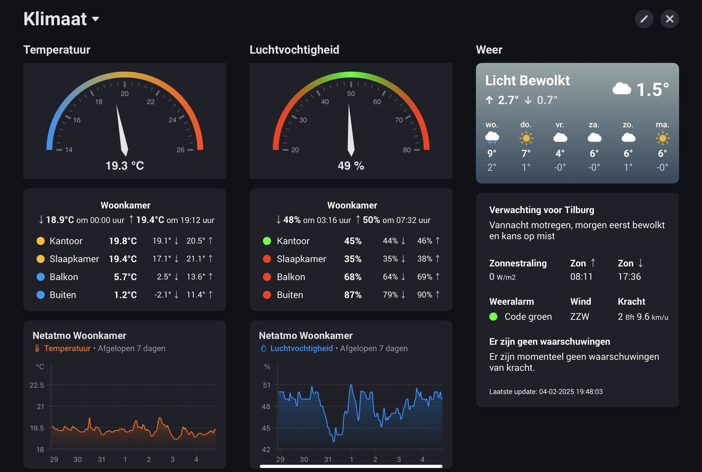
Following my power usage dashboard, I am sharing my climate dashboard. It focusses on inside and outside temperatures, humidity and weather metric.
The left column shows a gauge with the temperature in my main room: the living room (DataVista gauge widget, by @Erikvl87). Below that is a section containing current/min/max temperature readings.
The top part shows the min/max values and related timestamps for the living room. Below that the current/min/max temperatures for three other rooms as well as outside. The colors of the bullets change dynamically based on the current temperature and follow the same color scheme as the gauge (blue/yellow/red). For this section I used the status widget from the Enhanced Device Widget app (by @Adrian_Rockall).
Initially I used the DataVista status badge widget, that contains ready to use badges with a colored bullet. As I wanted some further customization, and inspired by @Cuprani 's dashboard in this topic, I replaced these by HTML formatting in a status widget from the Enhanced Device Widget app.
The bottom part contains a graph (standard Homey Insights widget) of the living room temperature in the last 7 days. The data is based on my Netatmo weather modules. The min/max values and related time stamps are each captured in its own variable, which is updated on a change in temperature and reset at midnight.
The middle column is dedicated to relative humidity metrics. The layout is similar as the left for temperatures. Again, the colors of the bullets change dynamically based on the current humidity and follow the same color scheme as the gauge (red/green/red).
The right column contains weather related metrics. The top part is the standard Homey weather forecast widget.
The section below that contains several metrics provided by the Dutch national weather service (KNMI). Like a description of the weather forecast, sunrise/sunset times and wind direction. It also displays weather alerts. Included color codes change depending on the current weather alarm (green/yellow/red). The widget is a status widget from the Enhanced Device Widget app. I formatted this using HTML.