Introduction
The purpose of this how-to is to provide you with instructions on how to set up a dashboard widget with clickable (actionable) icons. For example of favorite radio or TV stations. Like the example in the following screenshot.

When you click/tap such an icon, Homey executes an underlying flow that, for example, starts playing the radio station on your speaker.
Caveats
Caveats
- This how-to does not apply to the Homey cloud version, as it requires a community app to be installed;
- My Homey’s language is set to Dutch, so all screenshots of flowcards are displayed in Dutch. Use an online translation tool (like Google Translate) to translate them in your local language;
- This tutorial is based on a widget I created for start playing favorite radio stations on my Sonos speakers. As such you’ll se references to Sonos.
Ingredients
Ingredients
Apps
The basis for the widget is the Status Display widget that is part of the Enhanced Device Widget community app by @Adrian_Rockall.
For storing the icons we’ll use the official Gallery app provided by Athom.
Make sure to install these apps on your Homey.
Icons
Next you’ll need icons for each of your favorite stations. You’ll have to obtain (just google them) or create them yourselves. There are a few image requirements:
- Icons are square, or at least the same height;
- File type is PNG, though JPG should also work. SVG file types are not supported by the Gallery app and hence cannot be used as part of this tutorial;
- The minimum recommended size is 140px x 140px, in order for them to be displayed sharply. In my example I use icons of 300px. Larger sizes are not needed and may even slow down the loading of the widget.
Some online resources for station icons:
Once you collected your icons, upload them into the Gallery app. Its best to do this on a computer via the web app, as you need to obtain the image IDs, which works best on a computer.
After uploading them, you need to obtain the image’s ID/file name that was assigned by the Gallery app. This is a little bit of a tedious process:
- Again, make sure to access your Homey via the web app;
- Open the image library in the Gallery app (Settings (cogwheel) > Gallery app > Settings);
- Right click the image, for which you want to obtain the image reference, and select the Inspect option in your browser. Note that I am using Chrome, but assume other browsers have a comparable inspection option;
- The Inspect window opens and highlights the HTML section of the selected image;
- In the HTML code you’ll find an
urltag followed by a relative path and image name; - The image name is everything after the
../userdata/part, including the extension (c33592b7-6915-4291-8970-2273f30a1dff.png in the example).

Document these image ID’s as you’ll need them later on.
Flow structure
This tutorial assumes you use Advanced Flows. The widget uses two flows to create the widget’s content (HTML code) and a third flow to react to clicks on the favorite icons. Each of these three flows have their own canvas. You might want to go ahead and create empty canvasses for these flows:
- Flow 1: Style Widget – This flow defines the way the contents of the widget looks. By separating the styling code from the actual contents, we keep the flowcards easier to read and easier to maintain;
- Flow 2: Populate Widget – This flow populates the Status Widget with the HTML code needed to show the favorite station icons and make them respond to clicks/taps. Flow 2 used Flow 1 as input. You could, of course, combine them, but for readability I have split them;
- Flow 3: Respond to Click – This flow determines what action Homey performs when you click/tap on a station icon (the so called OnObjectClick event).

Variables
The first two flows use variables. Some are required; some are optional, though they increase readability and maintainability. For this tutorial I assume you’ll be using all variables. All variables are text based, so the green ones.
| Name | Value | Comment |
|---|---|---|
| EDW HTML Styling | (empty) | Contains the styling code of the widget |
| EDW HTML Body | (empty) | Contains the contents (body code) of the widget |
| IMG Location | /app/com.athom.gallery/userdata/ | Image location in the Gallery app (relative to your Homey’s address) |
| IMG ID Station Name (one variable for every station icon) | For example: a803c618-1d2a-4d21-ab39-1ab1cc5ba2fb.png | Image ID/file name of the station icon in the Gallery app, as determined in the Icons section above. This variable is optional. When not used, you need to hard code the icon ID in the flowcard itself. |
Make sure to create these variables and set their contents before continuing.
Build Flow 1: Style Widget
Build Flow 1: Style Widget
As indicated before the first flow defines the way the contents of the widget looks. It subsequently adds the styling code to the EDW HTML Styling variable:
-
The style block’s start
<style>and end</style>tags.
-
Format the standard table element:
table {table-layout: fixed; border-spacing: 0px; width:100%;}
This will make sure the widths of the table columns are fixed (don’t change based on the content) and the maximum available space is available. -
Format the standard row element:
tr {vertical-align: top;}
Aligns the contents (icons) to the top of a row. -
Create and format a custom class for spacer rows:
.trSpacer {height:10px;}
Spacer rows have a height of 10 pixels.
-
Create and format a custom class for station icons
.pictStation {margin-left: auto; margin-right: auto; height: 70px; filter: none !important; mix-blend-mode: normal !important;}
Station icons are resized to 70 pixels high. Note that many high resolution screens apply a display scaling of 200%, meaning that the icons are displayed in twice their size. As such the recommended minimum icon size of station icons is 140 pixels (2x70). Further, by default Homey inverts image colors based on whether you use light mode or dark mode on your mobile device. That is fine for black-and-white device icons. However colored station logo’s should be displayed in the same color scheme no matter the light/dark mode setting. The styling code contains instructions to override this default behavior.


Check the screenshot of the entire flow below.

Build Flow 2: Populate Widget
Build Flow 2: Populate Widget
The second flow populates the actual widget. In essence the widget is filled with a table consisting of three rows and four columns. It subsequently adds the HTML code to the EDW HTML Body variable.
The flow first executes the styling flow, so that the variable with styling code is available. Next it defines the start of a new table (<table> tag) followed by the definition of the column widths. The columns are grouped in a column group (<colgroup>). The total available table width (100%) is divided into four equal columns, each having a width of 25% (col style=”width:25%;”>).

Next, the flow creates a new row (<tr> tag), defines the four station icons and ends the row (</tr> tag).

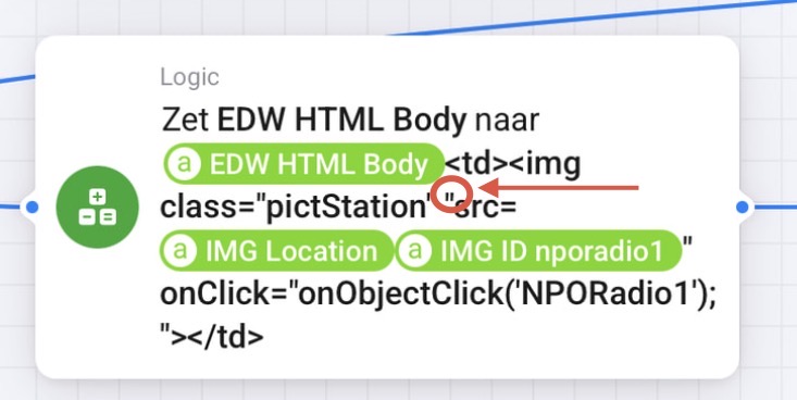
The definition of the HTML code for the station icons is basically the same for every icon.
- It defines a new cell in the current row (
<td>and</td>tags) - Adds the icon (
<img>tag) referring to its source (src="[IMG Location]-variable [IMG ID Station Name]-variable") - Adds the trigger that is fired when you tap the icon (
onClick="onObjectClick('SkyRadio');"). Note that each trigger has a unique Event ID. In this case I used the station name, without spaces, (e.g. SkyRadio) as Event ID.
In the last row of the widget, you may have noticed that I included a rectangular icon instead of a square one. It represents a shortcut to set my Sonos speaker to the TV input. Such a wide icon can simply be accommodated in the table by using 2 cells instead of 1.
In order to accomplish that you’ll need to add the colspan=”2” attribute to the cell. You are basically merging 2 cells.

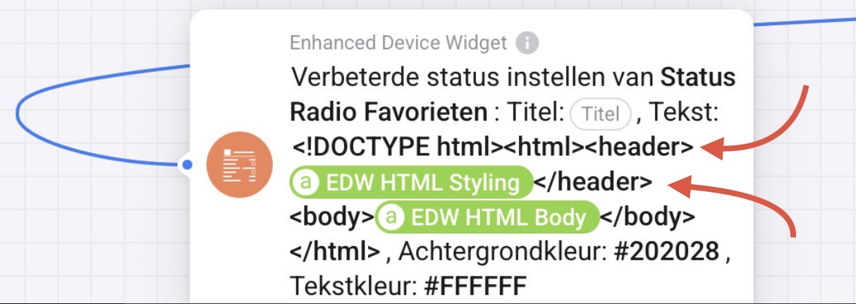
The final part is to populate and add this code to the status widget. For this you complete the ‘Enhanced Set Status’ flowcard, which is part of the Enhanced Device Widget app.
In essence you are creating an HTML page including the styling and body code (variables) you defined in the prior steps. In the ‘Text’ field, you insert the styling code/variable first in the header section of the page (<head>…</head>). The (variable containing) the table with icons needs to be inserted in the body section of the page (<body>…</body>).

You also need to specify an identifier for the status widget (‘Widget ID’). In this case I chose ‘EDW Status Radio Favorites’.
You can leave the ‘Title’ field empty. Note that you may need to provide a temporary title on the first run of this flow (in the next section of this tutorial), if the widget shows an ‘undefined’ message. You can remove the title after the first run.
Finally you specify the widget’s background and text color in the respective fields. Note that the color needs to be specified in a hexadecimal value with a leading hashtag sign. I chose #202028 (dark grey) and #FFFFFF (white) respectively.
Check the screenshot of the entire flow below.

Build Flow 3: Respond to Click
Build Flow 3: Respond to Click
The last flow determines what action Homey performs when you click/tap on a station icon. As you may recall we inserted OnObjectClick-code in each icon flowcard. Each icon was given a unique OnObjectClick ID, which this flow will use.
When you tap on an icon the status widget will trigger the OnObjectClick event and send along the ID. You can use Enhanced Device Widget’s “The widget ‘Widget ID’ has triggered the event ‘Event Type’” flow card to test which icon was tapped.
In this flowcard you specify the earlier assigned Widget ID. In the event type select ‘Object clicked’. Next you add a standard Logic card for each icon in which you test which of the icons was tapped, based on the Event ID. The Event ID is the ID you assigned earlier (in Flow 2) to the onObjectClick part of the code for each icon, e.g. ‘SkyRadio’ in my earlier example.

Next you link the action to be executed to each of the cases. In my example the flow starts another flow that plays the respective radio station on my Sonos. But you can add any flowcard that you like, of course.
Check the screenshot of the entire flow below.

Add status widget to dashboard
Add status widget to dashboard
The final step is to add the status widget to your dashboard.
On your dashboard, add a new widget and go to the Apps section. Scroll down to the Enhanced Device Widget section and add the Status Display widget.

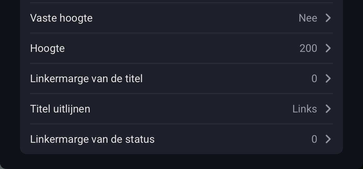
Next configure the settings as indicated in the screenshot. Most importantly, set the correct Widget ID (the same as indicated in Flow 2). Also make sure that ‘Dense layout’ is set to Yes, ‘Show X/Cross’ and ‘Show refresh icon’ are set to No, and ‘Left margin’ is set to 0.

Now you need to run Flow 2 once. This will populate the widget. If all went well, you should see the icons appear.
Final thoughts
Final thoughts
This tutorial results in the indicated table in the introduction. Of course, you can use the guidance to create larger/smaller widgets, based on the building blocks presented. Like the following examples of a widget to control your speakers and a TV remote:


That’s it. I hope you find this tutorial useful. Happy flow building!
 . Not sure how elaborate your flows are, but if you post screenshots of then I could read along.


