Please
Got it, thanks ![]()

Guessing it’s a new widget ![]()
1 Like
Nice, go for it. But I can’t explain what it’s supposed to be ![]()
Title/text bars with user configurable font size?
2 Likes

![]() Version 0.8.1 of DataVista is now available in the test channel, with the following changes:
Version 0.8.1 of DataVista is now available in the test channel, with the following changes:

 A cool new label widget has been introduced. Again, very minimalistic, ment for short text. Use it to show text capabilities, your Homey variables or push text to it via flows!
 Fixed issues with the datasource selection when processing capabilities without title
- Enhanced logging to improve crash handling and resolution
Documentation for the new widget can be found here: Label | DataVista
For inspiration, use the widget below your weather widget to show the weather forecast:

Additionally, a new guide has been added to the documentation website:
Tutorial: Visualizing hourly energy prices with a Gauge | DataVista
3 Likes
Close! ![]()
Nice one the labels, but I’m missing all my temperature and humidity capabilities? I’m also missing the yes/no variables.
Even better when you can place 2 or 3 on 1 line because now it’s one number per line in case of temp. same for the toggle

Hi Dirk, I initially decided to only support text types, and not numbers. I wasn’t expecting that anyone wanted to present something short like a number / percentage / temperature in this label widget.
I was planning on creating a seperate number widget for this instead, and thought the other existing widgets would fill the gap for the data types that aren’t supported by the label widget. Do you disagree?
Edit: I saw your edit regarding multiple values next to eachother. I really agree, but widget config will turn into a mess and I rather see this fixed by Athom, supporting more and different widget dimensions instead of making this the problem of the (every) app developer.
Neat and way to go!
I noticed that there are certain capabilities/fields listed in the data source list that result in a permanent spinner/loading animation when selecting them as source:
- Action Events (related to Device Capabilities/Advanced Virtual Devices);
- Device Generation 2 (related to Shelly devices);
- Device Generation 3 (related to Shelly devices).

I am not using any of these items for my dashboard (so not an issue), but don’t recognize those items. They are not capabilities displayed on the device’s tile nor are they variables. Not sure why they are listed.
2 Likes
Athom itself does support mutiple cards next to eachother, see my top flowcards.
A separate number card is fine, I dont’t know the difference. I would create cards based on their look and behaviour and let the user decide which data fits which card the best but that’s just my 2 cents.
Shame that Athom leaves us with 1 number per line in my case. I just wanted to get rid of the ugly device cards of my airco (see image 2)

Ouch! Ill look into this tomorrow! Thanks for reporting!
I ment I rather see the ability of smaller individual widget types that can be placed next to eachother on a single row (instead of one widget mimicking multiple widgets next to eachother by config). Additionally, Athom is cheating a bit. They have more extensive options for widgets that they do not offer to us developers.
I can create a visualization that displays multiple toggles or values next to each other, but Ill have to duplicate each setting in my widget for each entry, and since widget settings can’t be configured dynamically, that will quickly end up being a mess.
I understand and agree. I shouldn’t be deciding what you should or not show in the widget. Just to explain from my perspective, its easier to have a single purpose widget as I will know for what I am designing this. I’ll reconsider the supported data types.
Thanks for your feedback ![]() .
.
Redesigned my whole dash.
One datavista dash which shows statusses and one homey dash for controlling them.
Nice extra setting could be: add an horizontal line on top….

1 Like
@Dirk_vdM Just a quick update: I’ve been brainstorming solutions for grouping multiple states of the same type into a single widget, as you suggested. I’ll start experimenting with these ideas over the next few weeks, but I can’t make any promises yet. If it works out, it might be sufficient to make good use of the remaining white space.
1 Like
Normally, to get a decent outline, I’d prefer a simple setting: How many widgets of this type would you configure with a choice from 1-3?
In my case the temp bar and humidity bar could go together next to each other.
Simple numbers could come with 3.
1 Like
![]() Version 0.8.1 is now also available in the live channel.
Version 0.8.1 is now also available in the live channel.
1 Like
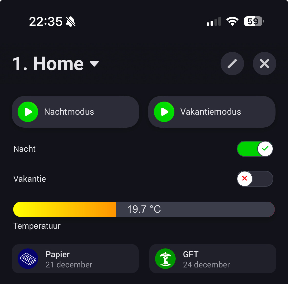
I have now tried the progress bar with different sources.
First, I used a “default” source, and the bar is updated as it should.
Then I tried to set the source through a flow. I ran it one time, to be able to select it as a source. All good. Changes are not updated though, the progress bar will only change if I close and open the dashboard again. The flow is doing what it should do, i.e. updating the source whenever there are changes, but the widget on the dashboard is not updating.
