Thanks for the screenshots. I have some additional questions:
- What version of DataVista are you running?
- What kind of tablet are you using?
- Does it also occur on other devices?
- Did you try removing the widget and re-adding it?
Thanks for the screenshots. I have some additional questions:
It is working great thanks.
I first deleted the widget(not the solution)
Then i created a widget from another divice(not the solution)
Then i did a reinstal of the app(not te solution)
Then i did a restart of the homey pro 2019(the solution)
I use the latest experimental version link that is share on this tread.
I use a phone samsung galaxy s22.
It dont have a other device yet(planning to buy a samsung tablet)
If there a more question just ask them!
I’m happy to help to improve(so far as i can with my low knowledge of ICT)
It is a very smal effort to share information, especialy in comperison to you, who did the development
Thanks again happy to have in working!
![]() DataVista v0.11.0 is now available in the test channel!
DataVista v0.11.0 is now available in the test channel!
This version has been submitted for certification to the live channel.
This version includes a minor new feature:
Thanks, Erik. That’s the solution for the positive/negative chart visualizesäd by color, right?
Just playing around i found a little hikup i think.
When i want to open a 1 houre line graph it went to demo mode.
No problem for me i was not planing to use it, just qurious how it was looking.
I was playing around to look for the option to show the last 24 houre in a graph insted of the day.
Now the graph from my weatherstation starts at and i can’t see the last data from the before. I was thinking maby i can set it to be a running graph from te last 24 houre.
See also the earlier discussion on rolling periods:
It might be included in a future release.
Check, thanks for the response
Hi @RonnyW, this is working towards a workaround for [APP][Pro] DataVista - #280 by RonnyW.
The most ideal solution would be to implement Add option to the progress bar widget to start from 0 · Issue #4 · Erikvl87/nl.erikvl87.datavista · GitHub.
The second-best solution is the following but still needs one bug to solve.
Configure the range dynamically via a flow from 0 to 5000 when the energy meter value is positive and configure the colors to, for example, yellow to red. And when the energy meter is negative, reconfigure the range from 0 to -5000 (*1) and reconfigure the colors from light green to full green, for example.
*1: Bug to fix: The progress bar doesn’t seem to play nice with ranges where the start position is greater than the end position (e.g. 0 to -5000). I’ll try to fix this asap.
Thanks for reporting, I’ll look into it.
As @SunBeech mentioned, it is on my radar. See [APP][Pro] DataVista - #355 by Erikvl87 for more info.
![]() DataVista v0.11.0 is now also available in the live channel!
DataVista v0.11.0 is now also available in the live channel!
This means the line chart widget is available for non-test users as well.
What if you add a keypad widget? So you can make something happen in flows if the code is correct? Would be pretty cool. So to for example turn your lights on you type a code like 5428?
As much as I like your idea, a keypad widget unfortunately doesn’t fit with the intention of this app, which is to visualize existing data from your Homey ecosystem.
Yeah just thought it would be cool with this app just because of the other stuff thisbapp already has.
Hello @Erikvl87,
i have 3 beautiful line graphs on my dashboard, i use them to check in on my boilertemperatuur witch one wil be heated by my wood burner.
in the first graph i have the temperatuur from the pipe and the lower boiler temperatuur probe.
in the second graph i have the lower temperatuur probe and the middle temperatuur probe.
in the third graph i have the middel temperatuur and the top temperatuur probe.
that are 4 line’s with the same imput(temperatuur) but to see them al and make them easy to check i need to fit it in to three graph’s
my excuse for the long introduction to my question:
do you think is wil be posible in the future to make al line graph with 3, 4 ore even more line’s?
Hi @qawsedrf57, thanks for your suggestion! You’re not the first to ask for a line graph widget that can show three, four, or even more lines, and it’s definitely feasible to add in the future, but I do need to sort out a few things first.
Right now, the line chart can handle two lines even if their data ranges are very different. This works because of the Y Axis Calculation Method setting, which can add a second Y-axis when needed. But if I allow more than two lines with different ranges, it becomes tricky.
Should I add multiple Y-axes? That would clutter the widget even more, since we already show one axis on the left and one on the right, and there’s not really space for extra axes. Or should I force all the lines to share the same Y-axis? If I do that, I would have to ignore the Y Axis Calculation Method setting, which could make the widget harder to understand and configure, because it would ignore a setting the user chose.
On top of that, each additional line would need its own configuration options in the widget settings. Homey’s widget options for developers are quite limited at the moment (for example, there’s no multi-select option for widgets). This means every extra line would add more individual settings, which could quickly clutter the configuration screen.
So for now, I need to find a good way to handle these situations before adding this feature.
Hello @Erikvl87,
thanks quick respons and explanation.
i do understand youre argument with the two Y Axis and that it is hard te implement even more, so why don’t make it work with just 2 ore 1 Y-Asis (all of us have wishes but not everything is posible) i think a lot of users including myself wil use the graph to compaire one kind value.
They wil compair(for example) prices with prices so they even need to be on the same Y-Axes otherwise it wil be hard to compair. so only one Y-Asis is needed.
i think(speculation) most users wil not compair(for example) pricies with themperature and another 3th value.
yes i also use it in a few occasions two different Y-Axis but that is only to save space on the dashboard, and a third Y-Axes wil not make it easy to read.
So in my opinion no need for a third Y-Axis.
According to youre configuration screen, i think it is a good system, very user friendly!
If you just make a third set of line’s for the configuration, it wil stil be a good system i think.
Last but most improtant, i’m not a developer, so you know what wil be posible and what wil be hard ore imposilbe.
i’m just a user who is very happy with how it works right now! and i just give my thoughts how to improve from my prespective.(i have also my wishes but not everythings is posible)
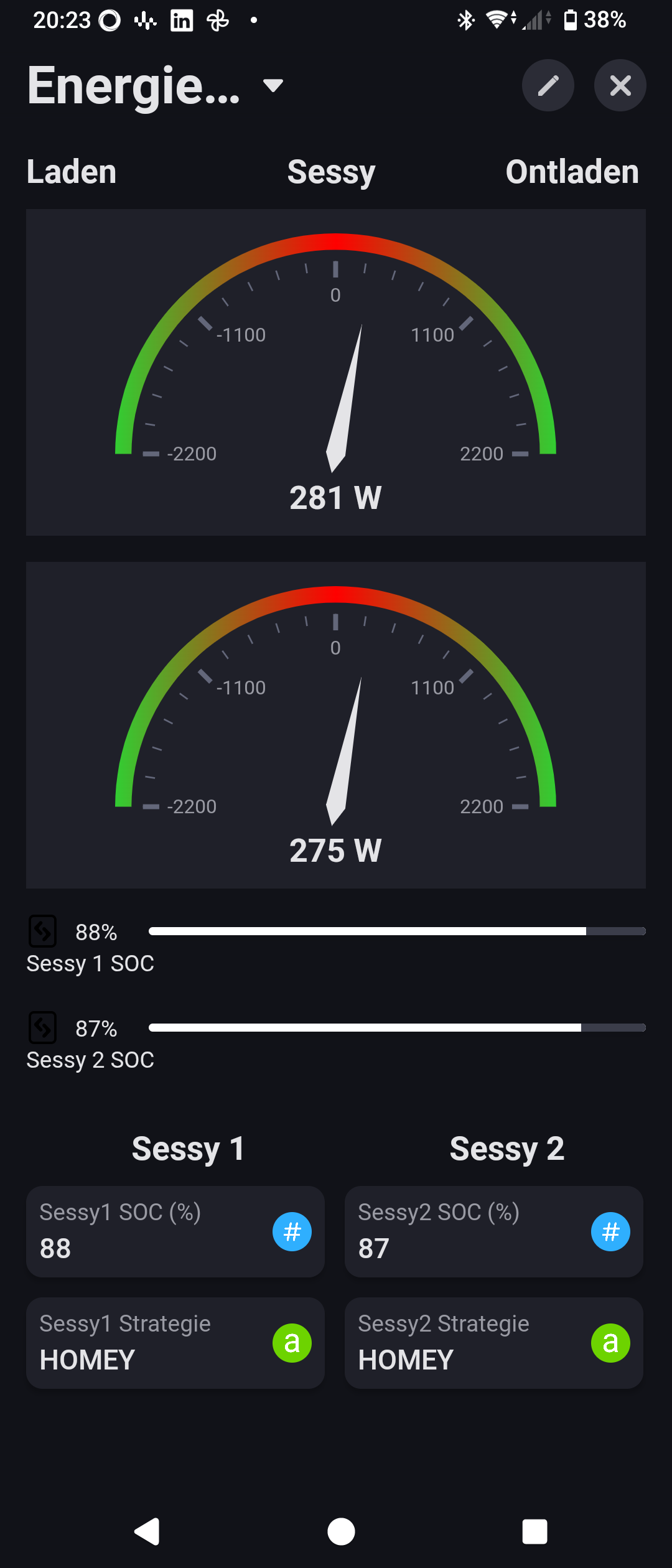
Hi @Erikvl87 ,
I use your progress bar to show the soc-value of my home batteries. I have more tablets on which I show dashboards for different purposes.
One dashboard with your progress bar is in LIGHT mode, the other is in DARK mode.
When I use a black bar it is not visible in the DARK mode, when using a white bar is is very good visible. But not in the dashboard in LIGHT mode …
Would it be possible to toggle the black bar for white and visa versa automatically if the background is toggled from LIGHT to DARK and visa versa?
Hi Bernd, thank you for reporting. Could you provide me with a screenshot of the progress bar in dark mode? The widget text and background should automatically change depending on the background, meaning in dark mode the text should become white, the background of the progress bar gray and the colors of the bar itself as configured.
Feature request: is it possible to have a maximum of 4 lines in the Line Chart Widget instead of 2?