I second this.


2 Likes
Hello,
I’m trying to create a status switch widget to show the state of airco / central heating if on or off. After completing the setup it just shows a spinning circle. Same when I use a different data set for example if HUE light is on or off. The progress bar widget has the same issue after adding a data set I only get a spinning circle. The only widget I got to work is the Gauge to show my live / daily energy usage.
Homey: 2019
Homey Firmware: 12.2.0
Homey App: Android 9.0.1.1629
DataVista App Version: 0.8.5
Samsung Tab A9+ 128GB Android 14
Hi @DerMathiasNLD, do you have the setting to hide the name enabled in the widget settings? If so, could you try and disable that and close & reopen the dashboard? There’s an issue with the widgets not working due to their height being under the minimum size required by Athom. Athom will decrease the minimum allowed widget size in an upcoming release.
That looks great! Cool to see how the widget is being used! Thanks for sharing!
1 Like
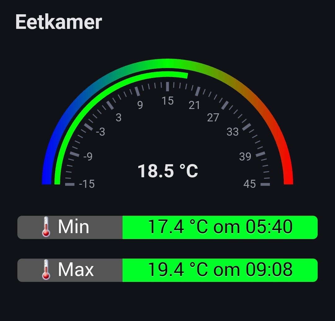
Hi,
This is what I have created to show status of my Living Room Airco it should show on or off.
Report code : a6b207ce-ad47-40ae-9f6a-f58f27babed5
Show Name: Enabled
Title: Airco Woonkamer
DataSource: Aangezet Airco Woonkamer True
Refresh: 5
Name Overwrite: -
Color When True: Limoengroen
Color When False: Rood
FA Icon When True: f00c
FA Icon When False: f00d
Show icon When Available: Ja
Could you create an app crash report and share with me the report id?
a6b207ce-ad47-40ae-9f6a-f58f27babed5

Thanks! I’ll look into it tomorrow and will contact you via a personal message.
1 Like
I have 2 inverters for solar panels but I would like to have them both in a widget (current power) simple meter
Does anyone have an idea how I can achieve this so that both assets are added together?
The named bullet works well I think ![]() Thanks
Thanks ![]()
Here’s how I’ve set it up:

Ideally I’d still love something very similar to the native controls above.
Note that there’s a bit of difference in the fonts between this widget and the native ones. It would be great if they’re more alike.
1 Like
Hi, I have found two things I need to request. The label widget puts all data on the same line. If the text is long it passes like a ticker. Fine, but the speed of the ticker depends on the lenght of the text string. If the text is very long, it is flushed through at unreadable speed. Can this speed be set at a fixed suitable ticker speed?
Next, in the gauge widget, I need to be able to set max scale value by flow. like 5000 in summer time, and 10000 in winter time. I do not want to change this manually, but automatically by flow.
Can these two requests be effected?
Definitely a bug! I’ll make sure to fix this! Thanks for reporting. Tracked at Ticker Speed in Label Widget · Issue #1 · Erikvl87/nl.erikvl87.datavista · GitHub
You should already be able to. Use the “Advanced gauge” and the DataVista action (then) card to set a range.
See the docs for more info: Gauge | DataVista
Let me know if you need more help!
1 Like
I will take these into consideration, thanks. I thought I aligned the font and size with Athom’s recommendations (Styling | Homey Apps SDK) so I am not sure if I didn’t apply those correctly or they aren’t following their own guidelines.
Are you looking to combine the values from both inverters and display the total as a single gauge? To achieve this, you can create a flow that triggers whenever the value of either inverter changes. Use a Logic card to add the two values together, and then use the DataVista action card (in the “then” section) to set a custom range with the combined value.
Once the custom range is set, you can select it as the data source for the advanced gauge in your widget.
1 Like
Could you share with me the device you are using? And is this also happening on other devices?
Issue tracked at Emoticons Cut Off in Label Widget · Issue #2 · Erikvl87/nl.erikvl87.datavista · GitHub
I’d suggest to time trigger it. If you trigger each change if each inverter it wil go every second on some days. Better update the variable every x seconds.

