Ah yes, it looks like when in transparent mode it doesn’t update the margins. I’ll fix this in the next release.
Maybe add an left/right/center align setting as well?
The font size is also different.
![]() Version 0.8.5 of DataVista is now available in the live channel, with the following changes:
Version 0.8.5 of DataVista is now available in the live channel, with the following changes:
 Fixed the bold configuration for the label widget not working when not in transparent mode.
- Fixed the padding for the label widget when in transparent mode.
 Adjusted the height of the label widget dynamically to a minimum depending on your widget settings (transparent mode & hiding the name).
 Increased the font size of the toggle switch widget to align with Athom’s widget style guide recommendations.
Hi @Erikvl87
Thanks for the widget! I’m working on my dashboard and want to show a sort of traffic light. I’m using a variable with a red ball to show if the coming thee hours the sun will shine. Also for the energy price.

Would it be an idea if you could set the icon with a variable? Like when an icon is avaible with the KNMI but then manualy so I can make a sort of status icon.
1 Like
I don’t want to get you all too excited just yet, as I’m still not sure if this feature will make it into the app—it’s a work in progress and still needs a lot of development. But I thought I’d share a little sneak peek of something I’ve been working on: a line chart widget that supports multiple data sources!

9 Likes
Hi @Mark_Mastop, this is probably something that concerns the progress bar and toggle switch widgets as well when using DataVista datasources so I’ll definitely look into the possibility of overwriting the icons dynamically. I’ll post back here when I have an update to share.
2 Likes
one of the biggest Problems of Homey, that they don’t have that. I would be very happy about it!
1 Like
Maybe It’s possible to just show a Status “LED” instead of the Toggle Switch, I use a variable to display if there is Mail in the Box, LED or Dot shines in a color, or is gray when empty.
1 Like
Very good idea indeed. I don’t really need the toggly, normally I only need to know if it’s on or off which a status led will do.
Something like this:

In case of an alarm (sensor) it’s red, in case of a device it’s green. So configurable colour.
2 Likes
Works, apart from the botton margin/padding.
As I don’t like to repurpose the label widget, I have created a dedicated status widget. It will be released within the next few days.
This status widget has no support for custom icons. The color and text is controllable via flows and/or via boolean variables/capabilities. It is ment for small status texts and will hide overflowing text. The “Status” text is adjustable in the widget settings.
The widget has a style option to transform it into a bullet status indicator.
Here’s a sneak preview. The visualization may still change.

7 Likes
You deserve a place in the Dashboard Hall-of-Fame!
Is there a beta I can join?
3 Likes
Thanks for the kind words! The new status badge widget will probably be released to the test channel tomorrow. You’ll then be able to follow the test installation link that I’ll post here to install it and try it out.
1 Like
![]() Version 0.9.0 of DataVista is now available in the test channel, which introduces a new Status Badge widget!
Version 0.9.0 of DataVista is now available in the test channel, which introduces a new Status Badge widget!

Don’t forget to try and use it via flows using the newly introduced DataVista set status action card. This action card allows you to enable/disable the pulse for emergency occasions ![]() !
!
Documentation can be found here: Status badge | DataVista
I’d love to hear your thoughts on the new widget!
3 Likes
I actually sat down by my computer today to create something like this, since I needed it - thanks for saving me tons of time ![]()
In general it works great and is easy to configure ![]()
On my wish-list would be:
- A “pill shape” version of this - like the native zone controls - where you can have two next to each other in one column. With a customizable icon and the background color behind the icon showing the status.
- Alternatively a version of “bar” where only the left part shows the staus color. Having the right part (which is quite wide) use the full color makes it take a bit too much focus for my use case.
- Colors that fit a bit better with the dark mode color scheme of the dashboards. Maybe using gradients which seems to be the general style Homey uses.
One extra thing for the wish list:
- A way to keep the left side of the widget the same size.
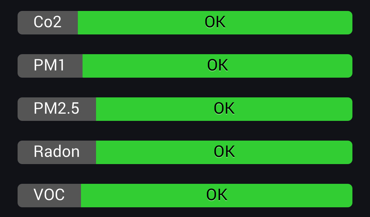
It looks a bit odd like this:
Thanks for the new status widget @Erikvl87 .
I’ve found a little improvement with the label widget. When using emoticons the top of the emoticon gets cut off. It’s just a couple of pixels.

Glad to hear this app has saved you some time!
I’ve been brainstorming an idea for a new type of state widget. This widget could display up to three states side by side, each with its own color and icon for better visualization. It’s still a rough concept, but I think it could align well with your needs. It is something I hope to work on (and hopefully release) somewhere in January.
Would the “Bullet” style work for you? If you’re missing the “Status” prefix, you can decide to prefix the actual status message instead. Additionally,
I added a Named bullet style in 0.9.1. Would that work for you? This version now also includes an option to set the width of the status name to a fixed width.

Ouch. Does this happen in the new 0.9.1 test version as well? I’ve added a potential fix to that version.
Yes I’m using that version.
Bullet lined at the right side would be nice, now it’s the opposite of the toggle.
