I can understand that, if you have spent a lot of time in creating something, it does not sit well when it does not work anymore due to causes out of your control.
Looking at the prior posts in this thread, I am sure @skogsaas is well aware of the current struggles with the current version of his app. And is likely working on improvements.
In the mean time: did you report your issue with the failing flow card to Athom? So that they can work on a solution.
Is the current Homey Dashboard an option to consider as a dashboard? It might not meet all your requirements, but at least it makes it possible for you to monitor your smart home.
Where did these four things go, I can’t see them in the list of Widgets that you can add to your Dashboard?
Device
Template
Text
Variable
What do you do if you want to show the value of a variable?
And in the old version you could show, for example, a Boolean and then have different icons depending on whether it was True or False.
You should always keep in mind with an alphaversion (or even beta) of any software that things might work or not, and that there is a risk you will lose your work. Looking at your dashboard you sure put a lot of work in them…
For me I don’t care a minute about my old dashboard being gone. The current state of this app is still a bit troublesome for me, but I have enough patience to wait for it to improve
F.e. an issue I’m having:
When I create a new dashboard and add a card, I cannot delete the card. Can’t drag it to the trashcan, deleting using the the cardmenu (…) does not work.
I add a grid, then a card, but then the card cannot be deleted, nor can I add a capability to the card.
I’m sure I’m not the only one with this problem?
And what I don’t get is that when I copy a card, I’m getting an actual clone; any change I make to the original is also made to the copy. The only use for copying would be copying part of your dashboard to easily change it to different capabilities? F.e. a list of temperatures, copy the element, then change to moisture
Ah okay. On your tablet you open the dashboard in a web browser, right? Does your browser have an option to change the dark mode for the browser only? Or is this a formatting issue only related to Dashboards? I am not a user of Dashboards myself, so I am afraid I cannot help you further.
i guess you use Grid and Cards for your example. How do you create the Text on Top of the Cards, like “Entrance and Gallery” ?
can you post an image in edit mode?
as a Sections widget with sections breaks differently with screen sizes, I put a List around it to get some vertically independent parts (with different horizontal widths) - because all sections within a Sections widget also have the same width
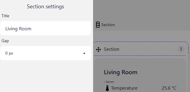
The Section itself can get a label if you clock on the breadcrumb for the Section on top
and can i have the vertical sections fill up space and not at the same horizontal level
i want to have another section where i painted the red circles…
I think font size cannot be changed … one of my permanant request to have more influence on styling
for the section/section model: not he always have the same height vertically if the appear in the same row: but the advantage is: if you open it on the mobile phone, you get them all in 1 single column, and there they all have the right size then …
e.g. try to make the browser window very small so that you see what I mean
I guess that’s more felxible than the grid after all … at least on different devices.