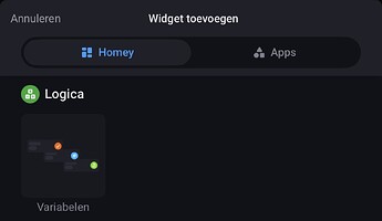
I’m new to Homey, and while I’m genuinely impressed by how powerful it is for complex automations, especially those that HomeKit can’t manage or tends to overcomplicate, I was really hoping the Dashboard feature would match that same level of refinement. At the moment, it feels like it’s missing a key piece, a set of simple, universal “default” widgets.
What would make a tremendous difference is a collection of clean, flexible “built-in” widgets that can display any numerical or status based data from any device in common tile sizes (1×1, 2×1, 4×1, 1×2, 2×2, etc.). This would create a foundation that works across all devices, regardless of whether an app developer has provided custom widgets.
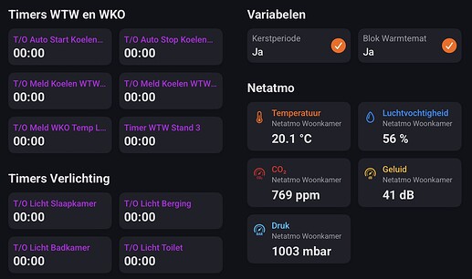
For example, my Netatmo indoor module reports temperature, humidity, CO₂, and noise levels. Since there’s no dedicated Netatmo widget, the only option is to add the device’s standard tile to the dashboard. Those tiles look exactly like they do on the Devices screen, with tiny barely readable numbers tucked into a corner of a 1×1 tile.
A “default” widget could instead display these values as large, clear numbers with an optional/custom label like “Temperature” underneath. Even better, multiple values could be grouped into one 2×2 or 4×1 block, making the dashboard feel more cohesive and reducing unnecessary visual fragmentation.
There are also other universally useful widgets that could benefit all users, such as a simple ON/OFF status tile that doubles as a toggle (e.g. for plugs and fans) and a progress bar tile for devices that report remaining time or percentage (e.g. dishwashers and washing machines).
Also, basic widgets like clock, calendar, and weather. These don’t need to be flashy, just the opposite, simple and consistent with Homey’s clean, minimal visual style.
Dashboards should make key information visible at a glance. My goal is to have wall mounted PoE Android tablets in different rooms, each running a dedicated Dashboard in kiosk mode, and for that type of use immediate readability is essential. The data is already available to Homey, it just needs a better way to present it.
I understand that app developers are responsible for adding widgets to their apps, but there really should be fallback “default” widgets for when they don’t. From what I’ve seen, brand made widgets are often visually inconsistent, and I’d much rather use a simple default that matches the overall Homey aesthetic.
I’ve attached a few examples below to show what I envision for these “default” widgets, as well as few more “complex” ideas and possibilities.


