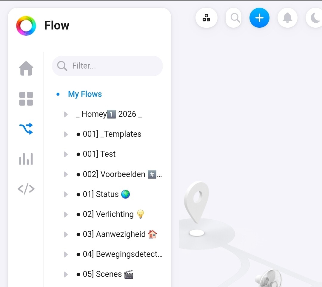
Did anyone notice the context menu bar hiding option? (at least it wasn’t there @ v1.15.1).
Works with any main menu entry.
Very handy for Advanced flow editing for example:
Just tap the flow icon to hide/unhide the context menu bar:

Did anyone notice the context menu bar hiding option? (at least it wasn’t there @ v1.15.1).
Works with any main menu entry.
Very handy for Advanced flow editing for example:
Just tap the flow icon to hide/unhide the context menu bar:
Didn’t notice that one yet, very useful for quickly hiding the menu bar on the devices tab as well (it works on all tabs)
Great find! This must have been added in one of the recent web app updates. Very useful.
Up until now I have been constantly dragging the navigation pane to collapse or expand it. This is so much easier  .
.
Any idea what that option actually does? Context menu’s seem to be the same after enabling it.
FYI: That screenshot does not seem to be from the latest web app version (v1.18.1). If you are using my.homey.app, refresh your browser.
That’s actually another version. Maybe the old one got cached in your browser? Clear the site data for my.homey.app and then refresh, it should fix the version
This is old local version which You can find in the latest update when You login by your IP. I want to use it. I don’t want to use new version 
Best regards
I don’t like the new Android app. In the past you just hit the tile and the device switched on or off. Now you have to hit a tiny button in the tile. No improvement…
Why not change that small power button icon into a settings or info button for the device? I change device settings much less then switching something on or off.
Maybe I’m getting to old, but this new interface is no improvement for me.
It’s too bad many people are really negative about the design change.
Personally it gives me a cleaner look but also more insights in my devices (at a glance)
Off course it would be nice if you can tweak the colours of the text a little bit so for some people it would be better readable , but overall I really hope Athom keeps the design like this.
More insights such as? For me the web interface shows exactly the same information as before, only harder to read now.
Well said and it’s a complete head wobble for muscle memory
Such as seeing my temperature of my rooms (thermostat) but also more easily opening or closing my doors. This is off course subjective, but for me it works!
OK, device dependent then as there’s no change on any of my devices. Automation to me means not having to push buttons, especially not using my computer, so I don’t really care how they work. But couldn’t the changes have been done without ruining readability?
Unfortunately when tapping the flow icon to unhide the flow listing, it shows the default listing again:
instead of the initial view with the folder with the focussed flow name:
Same goes for showing Flows belonging to a device.
When hide/unhide, the default listing shows again and the selection is gone.
I’ll report to Slack on this one.
Yes, indeed. This is ‘somewhat’ annoying. That’s why I am still collapsing and expanding the navigation pane manually. Thanks for reporting it to Athom  .
.
Hi Peter. Did You update to latest version 13.4.0? Could You say what firmware version is local web app? It is safe to update when I still want to use old web app GUI?
Uff…thx for information