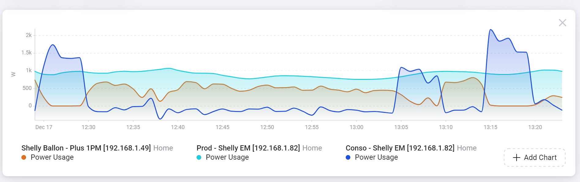
I’m wondering whether there has been a recent change to the way charts are displayed in the “Insights” tab. They look much more rounded and flattened than before.
It feels like the issue started yesterday.
I have an electricity consumption spike every 30 seconds, and I can no longer see it.
It’s as if an average over the last minute is being applied.
Do you know anything more about this? I couldn’t find any other thread on the subject.
And now they wait month until next big release instead of correcting this disturbing bug immediately? Stupid decision.
The insights are anyway somehow useless due to the averaging (because they do it already for the same day and do not wait at least some weeks). At least for the last hour and max 6 h Insights were helpful. But now….
Good, that I use anyway Google Sheets to log the mainly interesting insights.