So sorry. Looked at it several times. My mistake
Not a problem at all ![]() . If it wasn’t obvious its may also be something I should improve in the widget or documentation.
. If it wasn’t obvious its may also be something I should improve in the widget or documentation.
Just a quick question: Do you think there will be three or four values for comparison in the future? Then, of course, only with a fixed y value. ![]()
I love it!
I hope so! However, the current test version still has some bugs that I want to fix first. My main priority right now is ensuring the widget is fully functional and stable before moving on to the next steps. Once the chart widget is in a solid state and ready for a live release, I can focus on tackling this and try and add support for more series.
3 Likes
With DataVista it seems possible to display multiple inputs on the Y-Axis, but the X-Axis is still “time”. I’m however looking for an option to refer the X-Axis as well to an input (in a certain given triggered time frame). Is there something similar available for Homey, being developed, or is there any interest to develop the same? Scattered plots are very useful to identify correlation/trends/relationships in many applications.
For example: Voltage as input on the X-axis, and RPM on the Y-Axis. Usually each time a sample is made a point is displayed as a scattered dot.
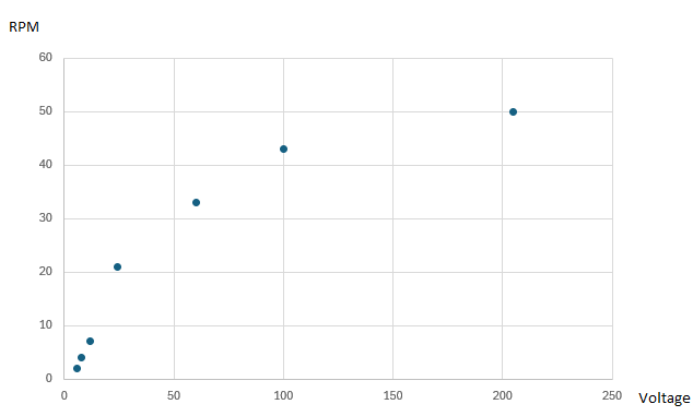
Not exactly, with DataVista it seems possible to display multiple inputs on the Y-Axis, but the X-Axis is still “time” (in your picture, weeks). And I’m looking for an option to refer the X-Axis as well to an input.
For example: Voltage as input on the X-axis, and RPM on the Y-Axis. Usually each time a sample is made a point is displayed as a scattered dot.
I like the idea, and I think this can be developed. It would likely be a separate scatter plot widget. I’m interested in exploring this, but as I mentioned earlier, my priority is finishing the line chart first. Thanks for suggesting the feature! I’ll post an update here as soon as I have one.
Hi @Erikvl87, are you planning to include additional rolling time periods, like ‘last 7 days’ and ‘last 24 hours’?
I like the week view:
- If you select prior period, then it nicely shows you a day by day graph. However, you have to wait for a full week, for it to refresh. Would be nice if the week would be rolling, so it is updated every day.
- The alternative is to select the current period. But then only the available days of that specific week are shown. If the current week has not ended then the series exists of multiple data points for the available day. In that case the labels on the x-axis are repeated (e.g., if only Monday has passed, 12x Mo, instead of the hours on Monday). Initially this was confusing to me, but now I understand how it is populated. Still my brain is wired in such a way that it expects to see a 7 day period in the week view
 .
.
2 Likes
Yes, that will likely be added to the widget as well. For now, I’m only using the exact datasets that expose both the current and previous resolution as provided by the Homey API. These contain “today” vs “yesterday”, “this week” vs “last week”, “this month” vs “last month” and “this year” vs “previous year”, hence the current implementation.
While the Homey API also includes data for the “last 7 days,” it doesn’t explicitly offer a “previous 7 days” option, so I’ll need to extract that from the “last 14 days” dataset. My focus has been on getting the basic implementation of the widget stable first, rather than immediately working on extracting custom timeframes from the available datasets.
2 Likes
Great to hear, I would be the first one to purchase/test it once available. I actually do have a logging program (at work) able to do this, but not available for home users. Perhaps I can take this chance to share how the ideal scatter plot would look like for me.
From experience quite quickly too many data is rendered in the scatter plot, and it will return an unusable view. To avoid this from happening the scatter plot would ideally have an external trigger to “start” and “stop” logging/rendering the data in the graph (by either an input high/low, or between a set time period).
After the “stop” is given, and a new “start” is triggered it would be a nice feature that you can set a preset path that either a new scattered plot is started when a new “start” is triggered, or if the the data is continuing in the same plot.
A possibility to set the sample rate for the x and y axis inputs, is also very helpful to avoid an overload of data. But could alternatively also be taken care off up front by using a filter.
1 Like
Thanks for the detailed description of your preferred implementation. Very useful and will make sure to keep this in mind when starting on such widget!
![]() Version 0.10.2 of DataVista is now available in the test channel! This version again contains some minor improvements.
Version 0.10.2 of DataVista is now available in the test channel! This version again contains some minor improvements.
 Removed the temporary fix for the Progress bar widget that prevented it from rendering smaller when the “Show name” option was disabled. This should now result in a more compact widget when the name is hidden.
 Improved Y-axis labels in the Line chart widget for series with significantly smaller values than the selected timeframe, reducing repetition.
- Fixed an issue in the Line chart widget where setting the timeframe to Month and comparing it to the previous period could result in an incorrect Y-axis when the previous month had fewer days than the current month.
 Added a new “Hour” timeframe for the Line chart widget. It extracts data from Homey Insights
 last6Hours, resulting in a step size of one minute.
2 Likes
Very nice, thank you, Erik.
A few things caught my eye ![]()
Hourly:
The new “Hour” time frame stays in demo mode:

Changing time frame to “Day” shows the actual data again:

Weekly:
Monday is missing, there’s two Sundays

Thanks for reporting, Peter. The widget reverts to demo mode in case of an error. It is already automatically logged and send to me so I’ll take a look asap.
I’ll also check on the labels for the Week view. Sorry for the inconvenience.
1 Like
Thanks. Sorry isn’t needed, we are testing stuff, right? ![]()
1 Like
App has disappeared after the update.
The widget’s don’t load and when I click on restart I get the message “not installed”.
62091460-4b93-4fd0-aa8b-91805cbeb131
Edit:
I re-installed the test version and now everything is working again.
I"ve read several posts of various disappeared apps or “app not installed” errors.
Seems to be a Pro 23 related issue.
Not seen before with the many apps I use.
Let’s see what happens if another new version is published…
@Erikvl87 , I posted this message in the Dashboard tread earlier:
A reply:
Many times when I wanted to view my Energy Dashboard it shows the Android Home page…
Maybe your implementation with the canvas api is not fully correct. Maybe this helps you to make your beautiful app more stable.
Thanks for pointing this out, Bernd. I’ve responded to try and get more details from Athom — at this point, I’m not convinced there’s a bad implementation, though there may be room for improvement. Either way, I feel this really calls for some proper development guidelines from Athom.
I definitely want to look into anything I can do to prevent these crashes, but I think I’ll need some support or direction from Athom to move forward.
1 Like
