Button + (Release 0.7.33, Test 1.0.0)

Thank you Adrian.

Take a look at the Device Capabilities App if you didn’t before, it is very powerful tool to combine multiple devices with entirely different capabilities under single Virtual device.

It has a very straight logic of organization that may work with Button+

Buttons

Booleans

Number Fields (dimming)

If your Internal Device Capabilities could properly understand values from this Virtual device it may be the key for WYSIWYG.

I don’t want to derail from the other discussions going on, but here’s a suggestion that I have been thinking about for a while:

A way to subscribe to/monitor a variable, and/or device variable state, so that the leds can change color/state without triggering a press or release command.

I’m currently managing this by sending color x to button y in a flow. But that requires a flow to run in the first place. If there was a way to subscribe to a value instead, then you wouldn’t need to define every single trigger and connect them in a complex advanced flow. The buttons would stay up to date “automatically” instead.

I’m not sure if I have misunderstood, but you can setup a button to show the state of a variable. Unfortunately Homey won’t allow an app to change a variable, so the only way to do that is via a Flow.

Interesting! I didn’t see it last time I looked for it.

But this seems to be for On/Off or True/False variables.. It’s useful, but String variables would be even better :wink:, I understand that we need to define the different options and store them within the app somehow, so it knows what to do.

In my case, I have a source variable, and different buttons on the button+ correspond to the different string values stored in that variable.

So if Source HDMI 1 is active, the variable will say Chromecast and button 3 will turn green, if HDMI 2 it will say DVR and button 4 will turn green etc.

And I think that these are more simple flowcards to proccess On/Off state.

Adrian_Rockall, I was thinking over the State Tag. May be it is a good idea to add a possibility for THEN flow cards for Top and Main Label to read the State Tag? So they will turn LED states based on what is set in Apps Configuration?

I think for that level of customisation, Flows are the way to go.

I am looking into expanding the options, but I doubt it will go that far.

I forgot to mention that string variables can be shown on the display.

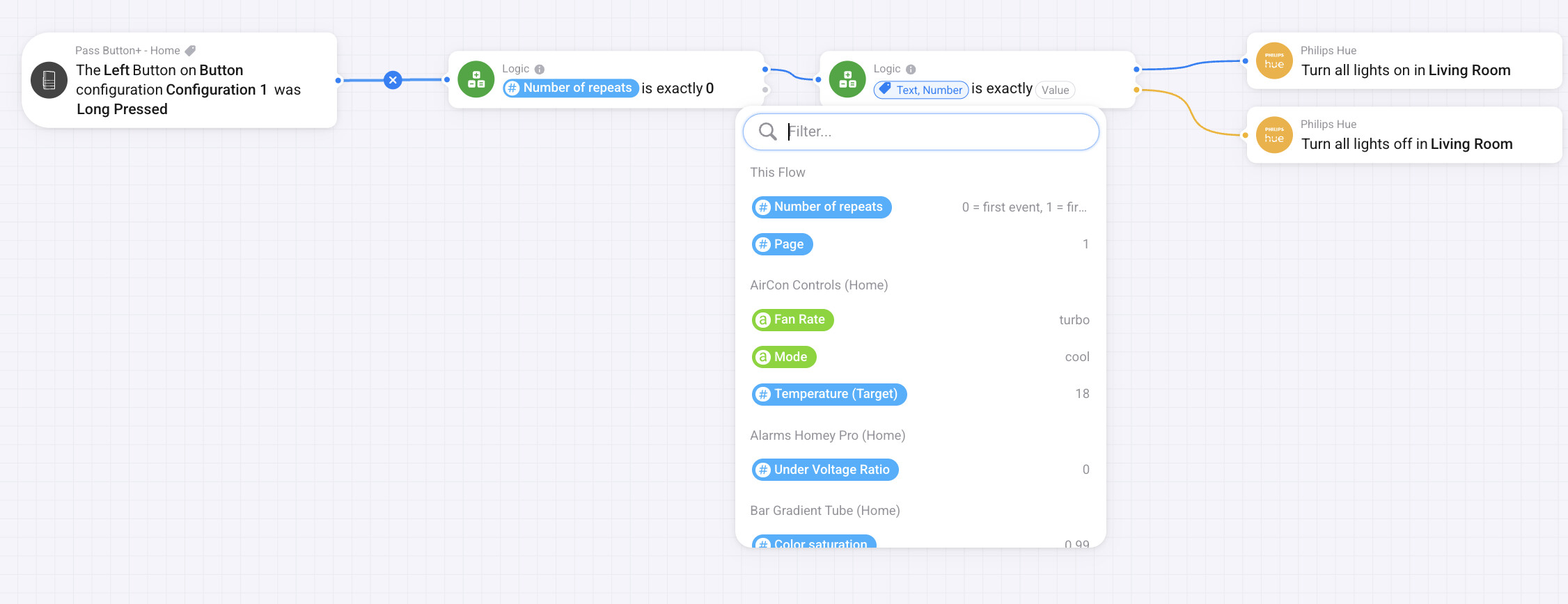
This is a flow I cannot finish without “State Tag” it is gone missing.

Ok, I failed making the script totally :(. Setting Long Press delay to 0ms crashes the firmware on Button+ it become unresponsive to Long press and non accesible via WebUI, as it fails to render. Looks like it gets into collision with other hold/release actions. Will investigate futher tomorrow

In the current version of the app, the state tag is a boolean, so that logic card won’t see it. You will need to use a a logic card for Yes/No.

I am currently making some big changes to the app after your previous requests, but it might take a week or so to do it.

I am thinking about deprecating some of the Trigger cards to reduce the clutter, so the only button cards that will remain are the two that combine the state.

They can do the same functions as 8 other cards. Also, I’m adding a value tag which is a string, so it is capable of indicating more than just true and false.

I am removing the filters from the capabilities and variables so any type can be selected. If the capability has a list of options you will be able to cycle through the list using the button and numbers can be incremental, etc.

You are doing great job!

I was exploring you app thought to find out if there may be some other clutter. I figured out that one AND flow card is missing parameter - the middle one on the screen shot - it should reference to a page or configuration. that is just FYI. I will wait till next version as currently configuring button back and forth gives a me a toothache :slight_smile: What is the better place to send you bug reports here or on Github? https://github.com/AdyRock/com.ady.button_plus/i

I am also wondering if the Configuration Switches via the Flows was somebody’s request or that is from “Pre Pages Era”, these requires soft reboot of the device, that show glitches on the screens and takes around 10 seconds, that is barely usable.

That was before pages. In V1 of the firmware it was instant as it didn’t require a reboot.

The update might take a bit longer as I have some ideas that I want to try.
The theory is it will be a lot more powerful but I’m worried it might be too complicated, so I need to consider the UI very carefully.
I don’t want to rush an update in case it blocks the new idea due to backward compatibility.

Take your time. Maybe the good point to direct it to an new App. Just as Shelly did recently - depreciated their App to Shelly (Leagacy) and rolled out a new one with completely different approach.

Got some info from Button+ / Rutger.

When Top Label is empty, the binding box will be smaller to only the label.

So when setting Y-position to 19% for the first element (Lämmitys) and the second column first element that doesn’t have Top Label to 19% also, there will be misalignment. Guide from Rutger was to set bigger Y-coordnate for those.

This means that to get elements with empty Top Label alligned with others on the same row that do have Top Label, I have to add +10 points to the Y-position. This then makes the Configuration page preview look off:

While the real display renders it correctly.

I will have a look to see if I can improve the representation. I’m never going to get it pixel perfect but I will try to get it as close as possible. The main issue is scaling as the DPI of the PC and phone screens it much higher than the display, so if I try to match pixels, the image on my mobile is tiny and hard to read. Then the resolutions are different on different phones and PC / MAC screens so it is a challenge :slight_smile:

I thought I would post a quick progress update as it has been a while.
The major changes are done and I am now testing and tweaking. It turned in to a big change so I employed AI to help, which was also a new experience for me. AI can do some great things, but it can also mess things up just as spectacularly, so I quickly learnt to do small steps with regular Git pushes and stashes :slight_smile:

Here are some screen shots from the update:

Show multiple button configurations at once

Collapsible controls for a cleaner view

New Advanced option for button definitions

Define individual button actions for Click, Double Click and Long Press / Repeat

All capabilities can be chosen for display:

The options show / hide depending on the capability chosen


Separate control of the LED

Assign the LED to a Hue capability to control the colour and have a separate capability to control on/off

Assign the LED to a blind position and the colour fades between the two settings based on the position %

New Groups to collate a full set of items that make up a full panel.

Again, with collapsible controls

Option for each device to use either current individual or new group mode

In group mode the device just has one picker to select the group:

new settings for the V2 panels that can measure luminance to control the display brightness

Hopefully, I will publish a test very this week once I can go a day without finding an issue :slight_smile:

Hopefully, the new version will work with all the old configurations, V1 / V2 panels and panel firmware, but as it is a big change, there may be issue, hence the new version number will jump up to 1.0.0

Wow that is impressive.

Can’t wait to gape my hands on this!

Nice work, if you need a tester , i’m currently building the button+ for my homey setup and running into all kinds of issues with svg’s and webinterface crashes(button+) so any major update is always welcome too see if i can find out what’s going on.

If you want to install it via the cli, the GitHub repo is open source and up to date.