Thank you for the update. I tested it, now I can ready the values using the extra large font.
1 Like
![]() DataVista v1.1.1 is now available in the test channel.
DataVista v1.1.1 is now available in the test channel.
This version:
 Improves the data precision on rolling timeframes in the line chart widget, which was lost in version 1.1.0. For more details, read this post.
Edit 29/10/2025 17:05: Now also available in the live channel.
Great app! Really love the stacked line charts.
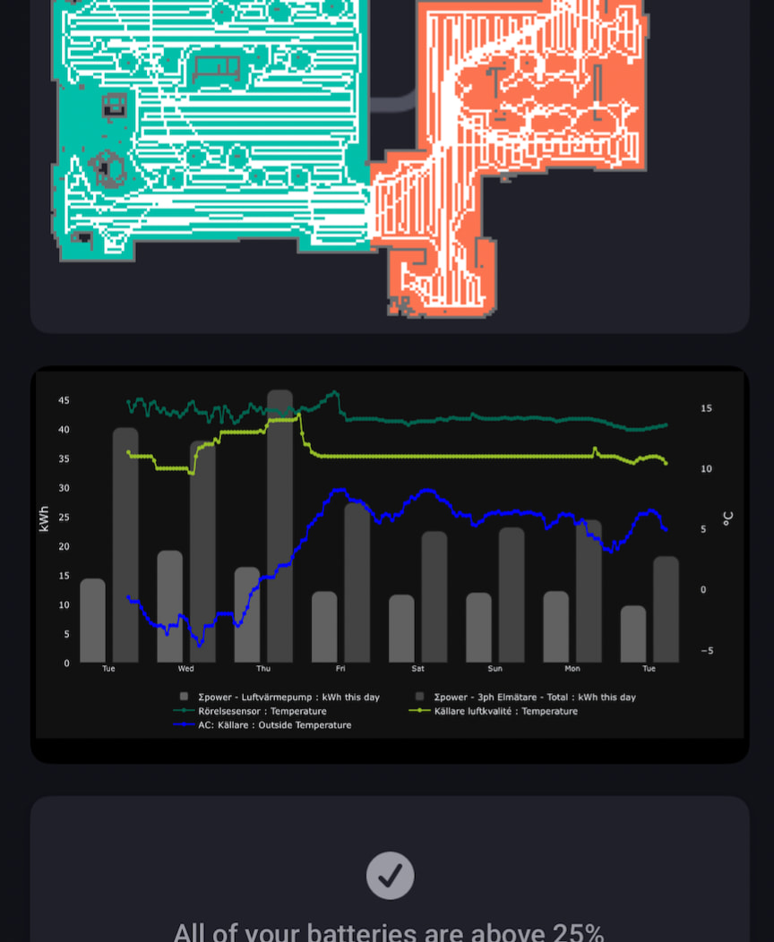
Let me add my voice to what I’ve already read above: it would be awesome if we could add a 3rd and 4th line (or bar, if possible) to the stacked chart. Still limited to two Y-axises of course.
What I am trying to re-create is the following type of chart, from Panasonic Comfort Cloud (Heat Pump):

It would also be nice to be able to specify the min and max y value for the series (rather than being based on the actual values). Some type of data is better visualized with a specified low point (humidity, temp, …)
Keep up the good work!
1 Like
Just started with Dashboard but this app is quickley becoming my Favorite ![]()
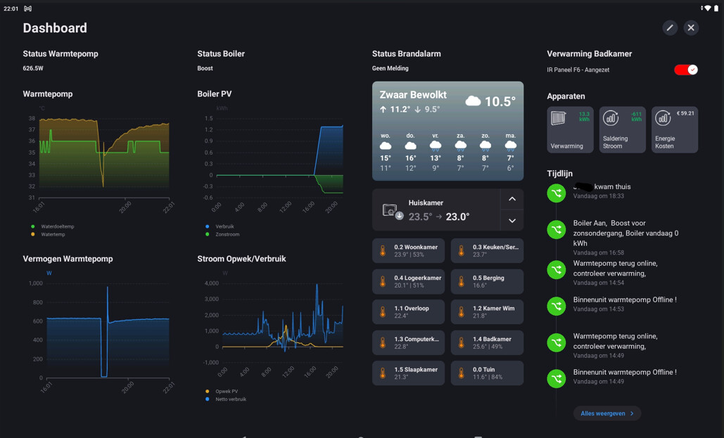
If I may ask : Is it possible to have a ‘Tijdsbestek’ of 6 Hours, like with the Homey Insight ?
A day is to much, and 60 minutes is to short in haveing a overview of my Traget and Watertemp in my Heatpump
Insight/6 hours:

Datavista 1 today ![]()

Datavista 60 minutes :

1 Like
![]() DataVista v1.2.0 is now available in the test channel.
DataVista v1.2.0 is now available in the test channel.
This version:
- Adds the 6 hours timeframe option to the line chart widget.
@JohanP
Thanks for the suggestions. I think the widget is now stable enough for me to start spending some time on looking into the possibility of adding additional lines to this widget.
3 Likes
Yes, verry nice…
[edit] screenshot:
Come to think of it, 12 hours would be nice too ![]()
![]()
(next update would be fine…don’t feel pushed)
1 Like
Jeeeyyyyy i can’t wait
1 Like
@Erikvl87 : Could you do something with the scale of the X-axis also ?
For 6 hour view I now see 4 and 2 hours scale?
Since it’s 1 hour for day view, 30 min. would be nice for 6 hour view…
Hi,
Sorry for popping in, but I have another request for timeframe: 48 hours - for me it would be very nice to monitor the effect of my modifications between the last 24h and the previous 24h. Left half of the chart previous 24h and right half the current 24h. Would that be possible?
Mentioning hours, I live in Norway where we have 24h time display. Which is also my windows’ TimeFormat setting. Despite this, DataVista’s Linecharts display its time axis in AM/PM format. How can I force to 24h format..?
Thanks a LOT for a great app!!!
best regards Tor
Why not create a graph with 2 lines ? I thought you could select current and previous episode just for this…
I know, but all my graphs have already 2 lines (many display ‘power used’ and ‘temperature’). It isn’t a big deal, but I just wanted to ask.
I’m a programmer myself and I thought it wouldn’t require much new coding….
on my dashboard i uses the 24h format, mayby a setting on the homey?
Whilst waiting for additional lines to be supported in this app, I solved my most burning issue by creating a Plotly chart and hosting it locally using FastAPI. Not the most beautiful of solutions, but could give some inspiration for where to take graphs going forward. ![]()
1 Like
Thanks for all the tips and suggestions!
I’ll also add some additional, commonly used intervals as well since they’re indeed quite easy to implement. I know “uncommon” can be a bit relative, but I’ll try to keep the list practical so the settings don’t get too cluttered.
The update for additional lines is still in progress. I need to divide my personal time with working on these changes. Sorry for keeping you waiting, but you definitely aren’t forgotten ![]() .
.
3 Likes
How hard is it to make the Label-widget (and the text in it ofcourse) resizeable ?
Would like to set date/time and probably date/weekday and show it as big as possible…
Just wondering, is your request related to the message you posted two weeks ago? I don’t have any plans to make a lot of adjustments to that particular widget, but I do have some rough ideas for a new widget that can display large numbers, text, or icons. It’s not very concrete yet, though.
Yes, I’m trying some stuff but can’t really find anything able to display large, screenfilling text…
If it would be a minour change, I’d like it. But don’t spend much time in it. I think other requests are more interesting…
