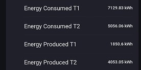
Same problem. Also Shelly related. They work when the phone/tablet is connected over 4G, but don’t work over Wifi.
@Erikvl87 Any idea? I have it for all temp sensors in my home. They ar always off with 0,1 or 0,2 %
Could you, right after one of the affected temperature sensors changes and the issue arises, generate a crash report and provide me with the report identifier?
And could you check the DataVista app settings and check what value is noted for “DV Bereik Temperature Badkamer” and if that is correct or also off. You should be able to find it under “Data → Ranges”.
Hi Erik,
could it be possible to make the top/bottom margins a bit smaller to save space and position the elements a bit closer?
There is vasted a lot of space ![]()
And place the text optionally inside the chart would also be nice to save space.
Is that already added? Haven’t seen it yet.
Hi @RonnyW, sorry for keeping you waiting. Apart from a lot of personal things that are keeping me quite busy, most of my time was dedicated to to this line chart widget (which will be released in a test version in the next few days). After that, I’ll make sure to get this included as well.
Thanks for the update. Just didn’t know if I missed an update ![]()
Btw…which JS module are you using for the chart? I’m curious because I searched a lot for my widget and used ECharts at the end.
After testing a lot of different libraries, I’ve eventually settled for ECharts as well. I was also very enthusiastic about JSCharting, but after contacting the developer I found that the license type was not suitable for an open source project.
Another sneak peek at what’s coming soon ![]() in the test channel!
in the test channel!
In the first test release, you’ll be able to select a timeframe (day, week, month, year), choose up to two different Homey Insights, and set a period for each insight (this or the previous period) along with a custom color. The widget will also be interactive to some extent, allowing you to toggle the displayed insights. The widget auto refreshes. Additionally, the refresh indicator can hidden via the settings.
Before this test release goes live, the legend will receive some additional improvements, and the refresh indicator will also see some refinements. Stay tuned!


![]() Version 0.10.0 of DataVista is now available in the test channel! This version introduces the new Line Chart Widget
Version 0.10.0 of DataVista is now available in the test channel! This version introduces the new Line Chart Widget ![]() .
.
With this new widget, you can compare two Homey insights in a single graph, making it easy to visualize and analyze the relationship between different data points.
As an extra feature, I’ve added the ability to click on any data point to get a tooltip with more details, providing you with deeper insights.

![]() Documentation is available here: Line chart | DataVista
Documentation is available here: Line chart | DataVista
As this was a more complex widget to develop, I’d really appreciate your feedback! I expect to make a few minor adjustments before releasing this to the live channel. Please let me know if you encounter any issues or if you have suggestions for improvements.
Note: On slower devices, it could take a while for the datasources to show up when configuring this widget.
Hi @Erikvl87,
Great widget again.
The screenshot shows in green the solarpanels. In blue the dishwasher. When the solar reached the 1000 watts the dishwasher turns automatically ON.
But… the legend shows for both charts ‘Energieverbruik (vandaag)’. Is it possible to rename this like you made in your other widgets?
Thanks, Rogier
Thanks @Rogier_Verheugen!
That is indeed very inconvenient. I will make sure you can rename this in the next version! Perhaps I can also find some space to display the device name.
From your screenshot I can also see I may need to refine the logic that determines if a secondary y axis need to be displayed, as your chart could easily used a single y axis.
Hi @Erikvl87
Did you made this offset on purpose? If yes, can you explain it? I think I prefer both zero lines equal.
Also if I select a name in the legend it shows only that chart and it changes when selecting the other. But how do I see then both again?
Rogier
That wasn’t done intentionally. Alongside some custom app logic, there’s also default third-party chart logic that may need some adjustments.
Most of your concerns should be resolved with the fix I mentioned earlier—merging multiple datasets onto the same axis.
I’ve implemented logic that determines whether an additional Y-axis is needed when datasets are too far apart. However, this still needs refinement. In your case, it should plot everything on a single axis from -2000 to 2000, but right now, it incorrectly creates a new axis from 0 to 2000 instead.
As for your other question, you should be able to click both legends to restore the initial visualization, as they function as toggles.
Thanks for all the quick and valuable feedback!
As always, again you created an awesome widget!
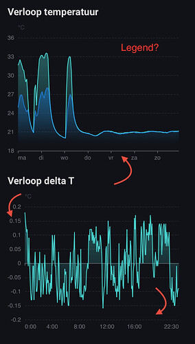
A few questions/observations, based on the following examples:
- How do I enable the legend? There does not seem to be an option to enable it and it does not show in my case (on iPadOS).
- The top graph (2 lines, week view) shows a thick x-axis. The bottom graph (1 line, day view) shows a thin x-axis. Would be nice if this is consistent. Personally I like the thin one.
- The y-axis of the bottom graph shows values with different number of decimals. Would be nice if the number of decimals is consistent. Ideally, you could specify it as a setting.
- Would it be possible to specify the min and max values of the y-axis? The second graph, with very minor differences in values on the y-axis, looks very erratic, due to the small scale of the y-axis.
EDIT: Please disregard the second bullet; RonnyW clarified it in his post below.
Both have the same line at the null(0) level.
Ah yes, now I see ![]() . Thanks for pointing that out.
. Thanks for pointing that out.
@Erikvl87: Some additional observations/questions:
- It seems that the faded fill color (under the line graph) is not applied to a single series line graph. Is this by design?
- There is an option ‘Show refresh countdown’ (‘Toon aftelklok’). Based on your documentation I understand that a progress bar should appear, indicating the remaining time until the next data refresh. If I toggle this option on, no progress bar/no additional info appears in the chart.
When using Datavista widget on systems with German settings the weekly display has only „Mo“ as weekdays. Am using an iPad


