[This post was for the old version]
@skogsaas another cosmetic change I observe. The capability widgets with more than one capability need an extra row of space to show the whole text of the last capability. I have to enlarge (and move) all widgets. This way, there is less room on the screen to show information. This combined with white space between widget’s makes me wonder…. Can you maximize space for information by removing some white space in widgets next to borders (margins), between rows in a widget and between widget’s?
Update 0.7.1 - Capability adjustments
I now know how Facebook felt when they adjusted the tint of their blue logo ![]()
I cannot fix everything at once, but I can start in one end and try to remedy some to begin with. I’ve done some minor changes to the capability widget. Label overflow is now hidden, same behavior as the native Homey app. This will hopefully help some @Torch1969 ![]()
As a temporary adjustment to sliders, they are now maximum 100px width. I’ve decided that the capability widget should not have sliders as a part of the widget card, but rather when you click the widget you should get a larger view with a slider. Basically the same as the native Homey app does it. Too much info/control, to little space for it as it is now.
Well thx for looking into this so quick and that enhancement ![]() , but that’s not what I meant
, but that’s not what I meant ![]()
This is how the old widget size in new layout looks like (looks like line spacing or fontsize is bigger?)
So to see all capabilities, I have to make the widget bigger, but that leaves a lot of unused space.
Maybe you could adjust the line spacing a little? Would be great if in future de widget hight sizes (snapping to the default grid positions) correspond with showing whole capabilitie lines…![]()
In the old layout this was ok as far as I remember… ![]()
Ah, try now ![]()
Line spacing is now dynamic, trying to use the entire space available. And line height is now reduced, so it can compress more in small heights.
(hopefully not introducing any new issues)
Wow, meep meep that’s fast (woody woodpecker running by…) ![]()
That’s a very nice solution, thx ![]()
Great job again, Marcus!
For the todo list:
1.
-Android Chrome & Firefox mobile view
-Toolbar closed
Edit widgets:
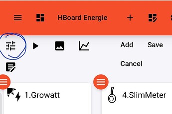
The capabilities button is hidden behind the menu button:
Changing to Desktop View it’s visible again:
.
2.
When I want to edit / add widgets outside the initial view, I can’t scroll up to press the save button, it only moves the widgets I touch. By ‘cheating’ a bit by moving a widget around, I can scroll up.
Jeeez, what kind of android device is this?
All UI elements looks enormous! ![]()
Try putting your finger in the space between the widgets’s…..
Same for me on iPad
@skogsaas I prefer a solution where the “setpoint”/“ingestelde temperatuur” can be added in two way’s in the widget, as a value (to read current setting), and/or as a slider (to change the setpoint).
I’m preferring the first one, but that’s because I am using this dashboard to review my system, not to control it.
@skogsaas I’m very enthusiastic about you’re dashboard. This is just what I needed to review how my automations work in and around the house.
Therefore the multiple insights graphs are a very welcome upgrade, but as you may suspect, this leads to new feature request’s ![]()
Could you, somewhere in future, add the possibility to set an alias text for a label text in a graph? Now it’s rather long. This could reduce the space taken by the labels and give more space for the graph itself….
As an example two graphs of my “heating” dashboard.
I quote myself ![]()
I’ll add it to the list ![]()
Can I ask, how did you manage to get multiple temperaures in 1 widget? (same for multiple lights, etc).
Sure, I’ve done this with the help of “device capabilities” Which is a app that can create virutal devices with text, buttons, etc and can get information from existing devices. Some learning curve but if you get it you can create nice devices, just check the forum post of this app.
@HoofdletterR
How did you manage to cast to your Google Nest Hub?
Did you use Local or Online Dasbhoard?
How did you sign in?
What’s the URL?
Hoping you’ll share your insights ![]()
Read all posts by Marcus my friend ![]()
But here you go:
.
Ha of course I tried, but it just kept on selecting the widget on the left, or right, or above, or below, no matter what I tried ![]()
.
I use Android 10, Chrome & Firefox
When you responded to this pic below, this was zoomed in using Desktop View, to better show the tiny part of the capability icon behind the menu button, so ignore the size of the UI elements ![]()
Just to be sure, because the answer is probably already given, here is the flow I use:
First I stop casting, then I mute (to prevent the casting tone), then I cast the local URL with API key and lastly I enable sound. The reason why I have “if casting is stopped” is that if, some reason, the casting stops the dashboard will be restarted. Hope you can see whats happening despite the dutch words ![]()
I just noticed I can click on insights label text to switch off and on one of the graphs in a multi-insights. So cool! ![]()
![]()


