Maybe you can put the legenda side-by-side if you can make the font smaller ?
For the graph you ideally would have as much V-space as possible I’d guess…
Maybe you can put the legenda side-by-side if you can make the font smaller ?
For the graph you ideally would have as much V-space as possible I’d guess…
![]() DataVista v1.3.2 is now available in the test channel!
DataVista v1.3.2 is now available in the test channel!
I’ll consider that for a future update. I think in most cases the width we have is just to small to present things side by side, but if I can find a solid way to measure and put them side by side, I’ll certainly consider that as it will indeed give the chart itself more room.
Hi Erik, Happy new year and thanks for the quick update.
Removing a line now works.
Some thoughts regarding your second point on the legend not showing when only one Y-axis exists. I think this change is a welcome improvement. Would it be an idea to also hide the ledgend when there is a second Y-axis, which has the same unit as the primary Y-axis?
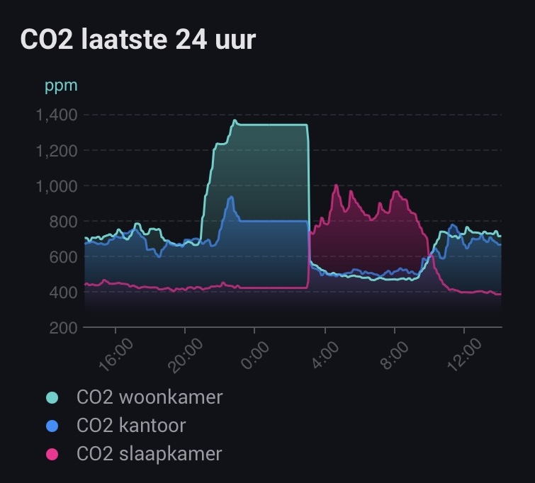
See the below example. The first graph shows 3 lines of CO₂ levels in ppm. No legend is show (OK).
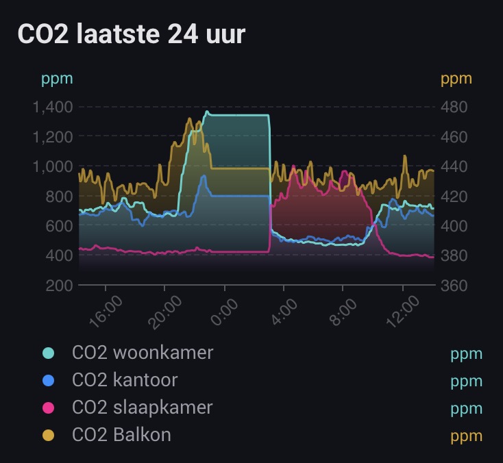
The second graph is the same, but with a fourth line added. Also of CO₂ in ppm. However, since a second Y-axis is shown, due to a different scale, the legend now shows the ppm-label behind each legend entry (as well as next to each Y-axis).
Personally I think hiding the unit in the legend would be a better option. An auto-hide also in this scenario or perhaps a user selectable option to manually show/hide the unit is something to consider.
Hi @SunBeech and happy new year to you too! Thank you for the feedback! The idea behind doing it like this is that without it, in your screenshot, you wouldn’t know to which axis the blue/pink series belongs to. That’s why the unit and its corresponding axis color is rendered. And for a consistent visualization, I decided to either show none or all units in the legend (which may be my OCD ![]() ).
).
(In this precise example you may want to consider forcing these series to the same axis using the Y axis calculation method option)
Does this make sense or are you still convinced the rendering logic should change?
Hmm, actually that does make sense. The graph shows either one or two Y-axis, but at the same time you can have up to four lines. And you would need to be able to determine which line belongs to what Y-axis.
And indeed, in the case of the example I can force all lines to use the same axis, which removes the unit labels in the legend ![]() . Didn’t think of that.
. Didn’t think of that.
By the way: I just noticed that you can toggle a line in the chart to (temporarily) show/hide by tapping on the legend entry. Neat!
You could give people a choice to put 2 next to each other an two under each other. Then you have the choiche to sorten the name or keep them longer if needed.
Just a heads-up, I’m doing some maintenance on the documentation website, so it may be unavailable for a while. I’ll post back when it’s back online.
Erik, stepped into the world of Homey recently, imported my Hue and Homewizard devices and resurected some NodOn Zwave ones I still had lying around. Already ordered more stuff. ![]()
And now I am busy creating some nice dashboards and DataVista is a real champ there! Thanks for all your work!
However, I ran into something I don’t understand and I hope @Erikvl87 or others here can help me on my way….
I’m using the Voortgangsbalk (progress bar) type of widget, but as databron (datasource) I can only select batterylevel (of Hue dimmers/sensors), HW PiB battery level (this I use already), dimmer level, color temp, color saturation and tint (for Hue lights) and some other things (processor usage as an example). I cannot select the power usage total of my HW P1 meter (only per phase) or the power usage of HW power sockets, which I would like to use the progress bar for (since the gauges are really huge).
Any way to do this? Or should I create virtual devices for each poer device I would like to display (a bit inefficient…)?
Thanks!
I really like the Homewizard display setup, nice and clean. But the only way to get those kind of gauges is to use external software and dashboards.
Can I make a feature request for these kind of gauges? A single widget with 3 gauges like the HW one or just a widget sized like the native Homey device button, so 3 fit next to eachother. Each gauge could have the value inside and a configurable maximum value.
Thanks!
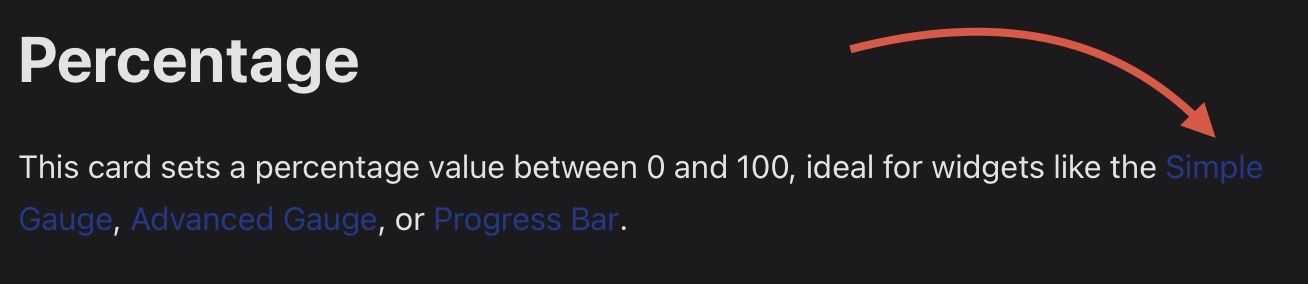
In a ‘simple’ progress bar, which you configure via the widget’s settings screen, you can only select percentage based capabilities (as it assumes a progress on a scale of 0-100%).
If you want to display other numeric values (like power usage), you first need to configure a progress bar range (‘bereik’) via a flow and run that ones. Next you can assign that range as data source to the progress bar.
E.g. the power usage of my refrigerator. First I created this flow:
Next use the range as the data source for the progress bar and you can create something like this (based on 5 different ranges / flows):
Also check the documentation in the first post.
Thanks! That explains a lot!
363Watt ? You got a huge Flight Simulator Rig setup ? ![]()
Or are you mining Bitcoins ![]()
Haha no crypto. It’s the consumption during gameplay. Graphic cards really like losts of power! ![]()
![]()
At least I was right blaming the GPU ![]()
![]()
Bad timing from my end…
I’m running into some issues with DNS / SSL that seem to be out of my control. Hopefully back up soon!
Hi, thanks for the suggestion! I have the same device at home, the gauges do look nice.
I’m a bit cautious about adding something like that. Right now the gauge only supports one metric, and making it work for multiple metrics or different visualizations could lead to a lot of extra requests and complexity. An additional widget style for the gauge widget themed like one of those single gauges would be a lot easier though.
I also think that a widget mimicking this exact visualization (and metrics) of the HomeWizard display should be provided by the HomeWizard Homey App instead.
I appreciate the idea though and will keep it in mind for the future.
The documentation website is (finally, ![]() ) back up and running https://datavista.erikvl87.nl/
) back up and running https://datavista.erikvl87.nl/
I’ve added a Flow Cards overview page to the documentation. It briefly explains the cards and which widgets they can be used with. It’s not much, but hopefully this makes it even easier to get started with DataVista.