# Webapp GUI changed (1.18.0)
**URL:** https://community.homey.app/t/webapp-gui-changed-1-18-0/156535
**Category:** Questions & Help
**Tags:** homey-pro
**Created:** [June 25, 2026, 7:47am UTC](https://community.homey.app/t/webapp-gui-changed-1-18-0/156535 "2026-06-25T07:47:22Z")
**Posts on this page:** 20
**Page:** 1
### Author:  [@Torbjorn\_Johansen](https://community.homey.app/u/Torbjorn_Johansen)
#### Post date: [June 25, 2026, 7:47am UTC](https://community.homey.app/t/webapp-gui-changed-1-18-0/156535/1 "2026-06-25T07:47:22Z")
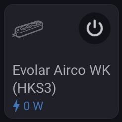
Can hardly see the status numbers on the tiles after the update.
The bold light green number top right is now a tiny blue number bottom left.
It does not work well in dark mode.
Any way to configure this as a user?
---
### Author:  [@Torbjorn\_Johansen](https://community.homey.app/u/Torbjorn_Johansen)
#### Post date: [June 25, 2026, 8:30am UTC](https://community.homey.app/t/webapp-gui-changed-1-18-0/156535/2 "2026-06-25T08:30:22Z")
Changing to larger tiles and reading the additional data field directly instead of trying to read the status indicator is a workaround. Maybe I’m getting to old.
---
### Author:  [@Mike\_Nono](https://community.homey.app/u/Mike_Nono)
#### Post date: [June 25, 2026, 8:41am UTC](https://community.homey.app/t/webapp-gui-changed-1-18-0/156535/3 "2026-06-25T08:41:48Z")
In the web-browser? They look just fine to me, have you maybe changed the zoom level in the browser? Test to reset it. Hold button CTRL + 0
---
### Author:  [@Lukasz\_Kostek](https://community.homey.app/u/Lukasz_Kostek)
#### Post date: [June 25, 2026, 9:47am UTC](https://community.homey.app/t/webapp-gui-changed-1-18-0/156535/4 "2026-06-25T09:47:44Z")
Who asked for these changes? It was perfect before. Why change the font from green to blue, which is much less legible? The new app look is AWFUL!!!
---
### Author:  [@Asterix](https://community.homey.app/u/Asterix)
#### Post date: [June 25, 2026, 10:12am UTC](https://community.homey.app/t/webapp-gui-changed-1-18-0/156535/5 "2026-06-25T10:12:05Z")
I think it turned out really well and is great. It’s also more consistent now 👌🏽
---
### Author:  [@evenprime](https://community.homey.app/u/evenprime)
#### Post date: [June 25, 2026, 10:18am UTC](https://community.homey.app/t/webapp-gui-changed-1-18-0/156535/6 "2026-06-25T10:18:05Z")
Already loved the update for the App (apparently now also live), and finally web matches the new design better.
---
### Author:  [@Torbjorn\_Johansen](https://community.homey.app/u/Torbjorn_Johansen)
#### Post date: [June 25, 2026, 11:13am UTC](https://community.homey.app/t/webapp-gui-changed-1-18-0/156535/7 "2026-06-25T11:13:50Z")

Contrast in dark mode is a joke for the blue color. Maybe better with a bold font. The previous bold green was at least readable.
---
### Author:  [@Torbjorn\_Johansen](https://community.homey.app/u/Torbjorn_Johansen)
#### Post date: [June 25, 2026, 11:16am UTC](https://community.homey.app/t/webapp-gui-changed-1-18-0/156535/8 "2026-06-25T11:16:09Z")
Fingers crossed that the mobile app (Android) will NOT get this update.
---
### Author:  [@smarthomesven](https://community.homey.app/u/smarthomesven)
#### Post date: [June 25, 2026, 11:32am UTC](https://community.homey.app/t/webapp-gui-changed-1-18-0/156535/9 "2026-06-25T11:32:54Z")
It’s already updated (in beta at least)

---
### Author:  [@RuuduitdeG](https://community.homey.app/u/RuuduitdeG)
#### Post date: [June 25, 2026, 12:30pm UTC](https://community.homey.app/t/webapp-gui-changed-1-18-0/156535/10 "2026-06-25T12:30:04Z")
Indeed, hard to read for older people (like me and many other enthusiasts)
The contrast is low - and the size of the numbers too..
Some customisation to optimise this for each individual eyesight would be nice.
---
### Author:  [@SunBeech](https://community.homey.app/u/SunBeech)
#### Post date: [June 25, 2026, 12:36pm UTC](https://community.homey.app/t/webapp-gui-changed-1-18-0/156535/11 "2026-06-25T12:36:17Z")
Actually, on the mobile app the readability is better, as it uses a darker shade of gray for switched on devices, compared to the web app:
Web app on vs. off


Mobile app on vs. off

Perhaps Athom forgot to change the gray tone of the switched on devices in the web app 🤔.
---
### Author:  [@RuuduitdeG](https://community.homey.app/u/RuuduitdeG)
#### Post date: [June 25, 2026, 1:03pm UTC](https://community.homey.app/t/webapp-gui-changed-1-18-0/156535/12 "2026-06-25T13:03:22Z")
I agree, the On / Off is a major improvement over the previous version.
---
### Author:  [@Lukasz\_Kostek](https://community.homey.app/u/Lukasz_Kostek)
#### Post date: [June 25, 2026, 2:03pm UTC](https://community.homey.app/t/webapp-gui-changed-1-18-0/156535/13 "2026-06-25T14:03:32Z")
```auto
```
I don’t understand the point of that on/off button in the corner. Before, you could just tap anywhere on the tile, but now you have to aim for that specific button. I have 180 sensors, and for 90% of them, there’s no option to configure anything else. The gray text under some sensors is practically unreadable in dark mode. The labels under many sensors are now misaligned and scattered all over the place; they used to be neatly aligned, but now it looks really poor. I hope they refine this in future updates. From my perspective, what was once a practically perfect app has turned into a mess.


```auto
```
Some labels are positioned higher and others lower because information such as energy consumption is displayed at the bottom.
---
### Author:  [@DirkG](https://community.homey.app/u/DirkG)
#### Post date: [June 25, 2026, 2:18pm UTC](https://community.homey.app/t/webapp-gui-changed-1-18-0/156535/14 "2026-06-25T14:18:56Z")
> [@Lukasz\_Kostek](#):
>
> Why change the font from green to blue
The energy dashboard in the smartphone app displays positive power values (W) in blue and negative power values (W) in green.
Since all devices with connected loads generally display positive power values, the color was presumably changed to blue for all other devices as well, including, for example, sensors.
So the color scheme in the Energy Dashboard and the color scheme in the “Devices” category were inconsistent.
---
### Author:  [@Mike\_Nono](https://community.homey.app/u/Mike_Nono)
#### Post date: [June 25, 2026, 2:22pm UTC](https://community.homey.app/t/webapp-gui-changed-1-18-0/156535/15 "2026-06-25T14:22:21Z")
Have you tried toggle the quick action in setting for the tile?
---
### Author:  [@Lukasz\_Kostek](https://community.homey.app/u/Lukasz_Kostek)
#### Post date: [June 25, 2026, 2:32pm UTC](https://community.homey.app/t/webapp-gui-changed-1-18-0/156535/16 "2026-06-25T14:32:18Z")
It doesn’t make sense, because the on/off function works when you click anywhere on the tile. Adding that button just creates clutter. And since the values are at the bottom, the text alignment gets thrown off. Many people probably don’t notice, but it bothers me—especially since the design used to be polished. Now it looks like someone just threw something together without checking it at all.
But maybe it’s just me.
---
### Author:  [@smarthomesven](https://community.homey.app/u/smarthomesven)
#### Post date: [June 25, 2026, 2:44pm UTC](https://community.homey.app/t/webapp-gui-changed-1-18-0/156535/17 "2026-06-25T14:44:36Z")
> [@DirkG](#):
>
> The energy dashboard in the smartphone app displays positive power values (W) in blue and negative power values (W) in green.
Is that only for the Energy tab? Because on my Homey Pro 2019, all the positive energy values are still in green (Energy page from the Devices tab)

---
### Author:  [@DirkG](https://community.homey.app/u/DirkG)
#### Post date: [June 25, 2026, 2:58pm UTC](https://community.homey.app/t/webapp-gui-changed-1-18-0/156535/18 "2026-06-25T14:58:20Z")
Yes, it seems so.
If I tap the “Energy” widget in the “Devices” category, the positive power values are displayed in green, too. So it’s also inconsistent.
But this is how the Energy Dashboard looks like:

---
### Author:  [@Lukasz\_Kostek](https://community.homey.app/u/Lukasz_Kostek)
#### Post date: [June 25, 2026, 3:06pm UTC](https://community.homey.app/t/webapp-gui-changed-1-18-0/156535/19 "2026-06-25T15:06:23Z")
I think Green color was a lot better for energy measurement in tiles
I don’t know if it’s due to the new version, but in Safari, the tile names are getting messed up and splitting into two parts. It looks fine in Chrome and on mobile. Are you experiencing this too?
Safari

Chrome

---
### Author:  [@Henrik\_Johnsson](https://community.homey.app/u/Henrik_Johnsson)
#### Post date: [June 25, 2026, 4:00pm UTC](https://community.homey.app/t/webapp-gui-changed-1-18-0/156535/20 "2026-06-25T16:00:52Z")
Usability fail. Values in grey have very poor contrast in both light and dark theme, less than 3:1 in the light theme.
Can’t say for sure but the text for values seems smaller than I remember it being before.
[Next page](https://community.homey.app/t/webapp-gui-changed-1-18-0/156535.md?page=2)